London Diary / December 2021
Is plastic good? Should an exhibition have a soundtrack? Does the white cube experience trump all? Sample some of Eddie Frankel's provocative musings as he tours London's current exhibitions.
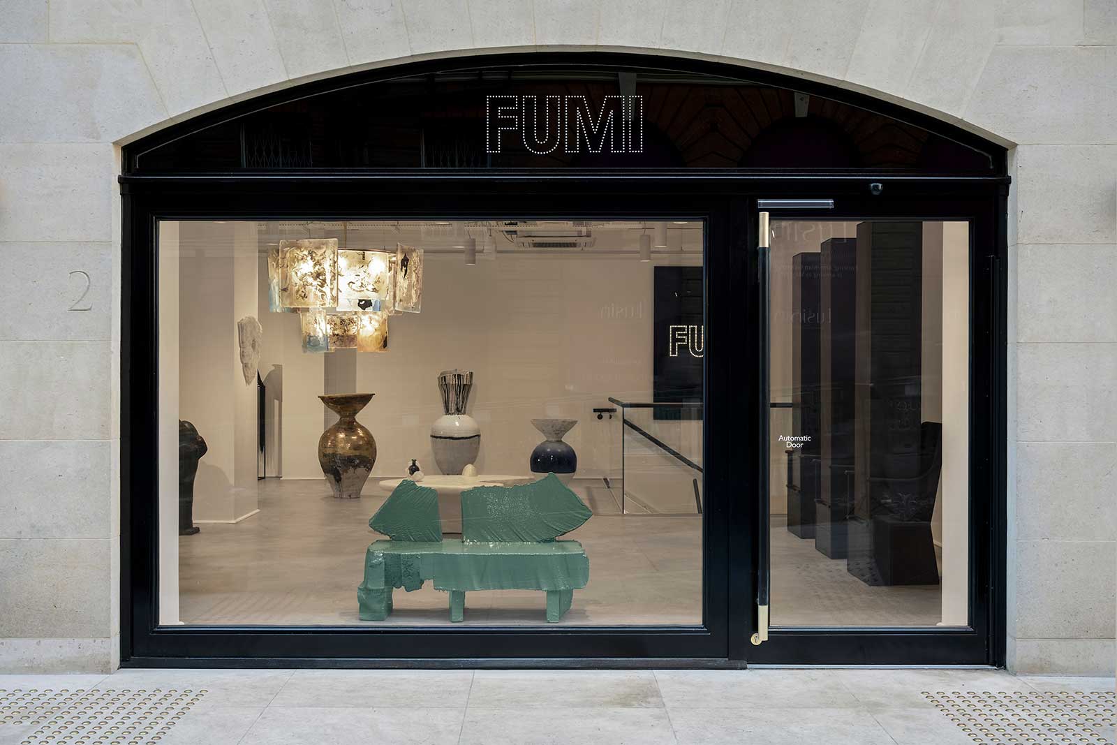
Gallery FUMI
COURTESY: Gallery FUMI
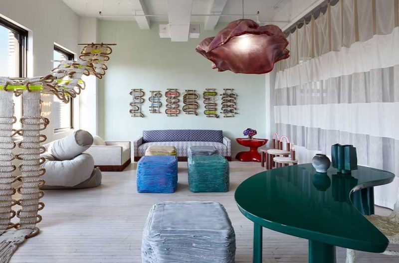
AH, CHRISTMAS TIME, filled with the sound of children laughing, carollers carolling, bells jingling and, at Gallery FUMI in Mayfair, chill-out music.
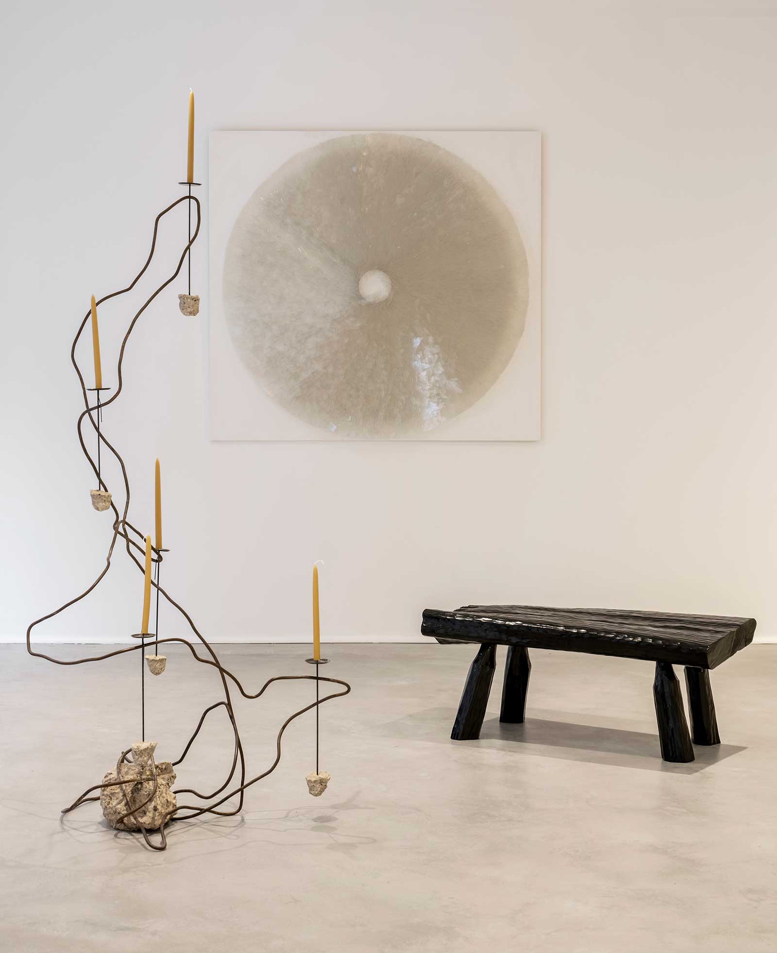
(Left to right): JAMESPLUMB, ‘Steel Roots XI’ floor-standing candelabra, 2020; Josepha Gasch-Muche, ’07/02/18′,
2018; Max Lamb, ‘Urushi Bench (Black)’, 2021
COURTESY: Gallery FUMI
Let’s be clear, objectively speaking, the best soundtrack for looking at an exhibition is total, pure, contemplative, absolute silence. But there are some beautiful objects on display, prime among them being Max Lamb’s rough-hewn, high-gloss benches. They’re simple, angular things, all stark and weird and semi-industrial, and they’re some of the best bits of design on show in London this winter.
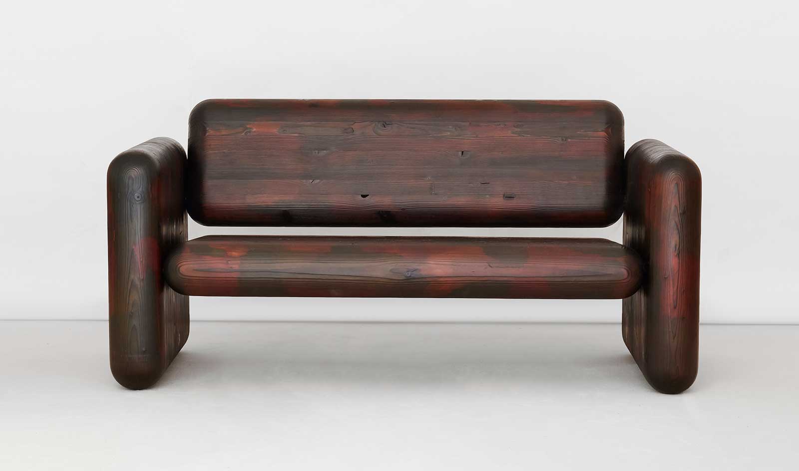
Max Lamb, ‘Glulam Pillow Sofa’, 2020
COURTESY: Gallery FUMI.
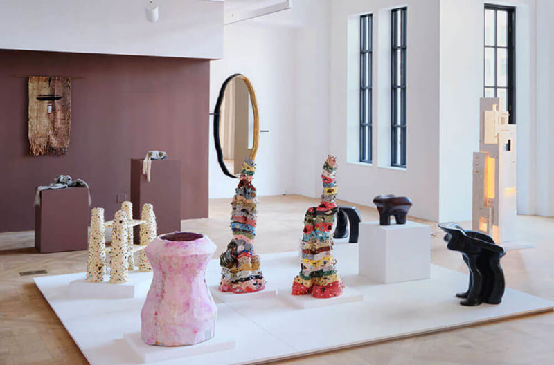
Out in Barnes, at Sarah Myerscough gallery, Luke Fuller’s ceramics are these gorgeous, elemental objects, they look like giant abandoned hornets nests, petrified casts of some subterranean passageway, with their rough, bark-like outer shell hiding smooth crackled interiors.
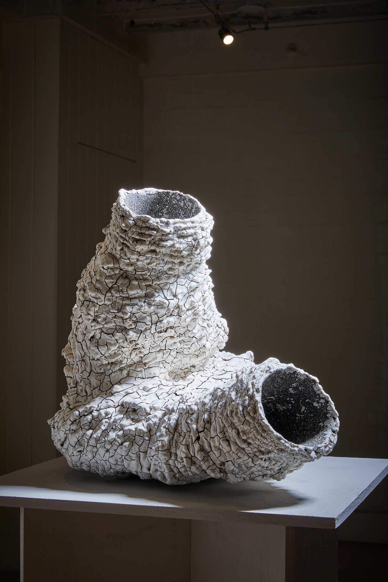
Luke Fuller, ‘Regolith II’, 2021
COURTESY: Sarah Myerscough Gallery
” [These] empathetic, passionate sculptures explore the bodily in relation to land, space and time”
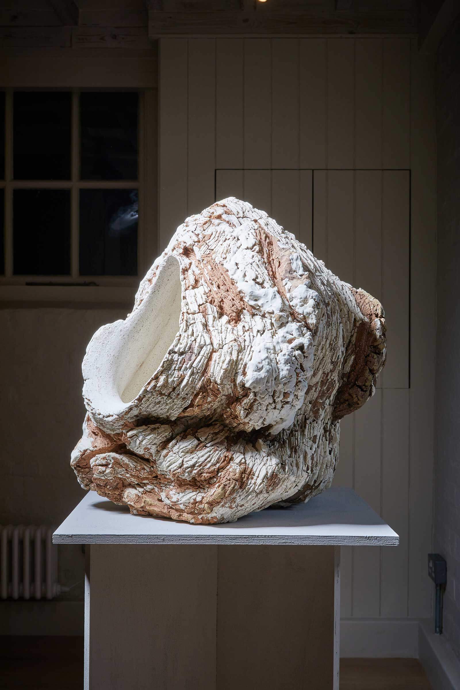
Luke Fuller, ‘Xeric’, 2021
COURTESY: Sarah Myerscough Gallery
“Coarse, highly grogged clay bodies have iron chromate and manganese dioxide applied and colours underscore restless animation”
They’re presented minimally, in a beautiful space, in silence.
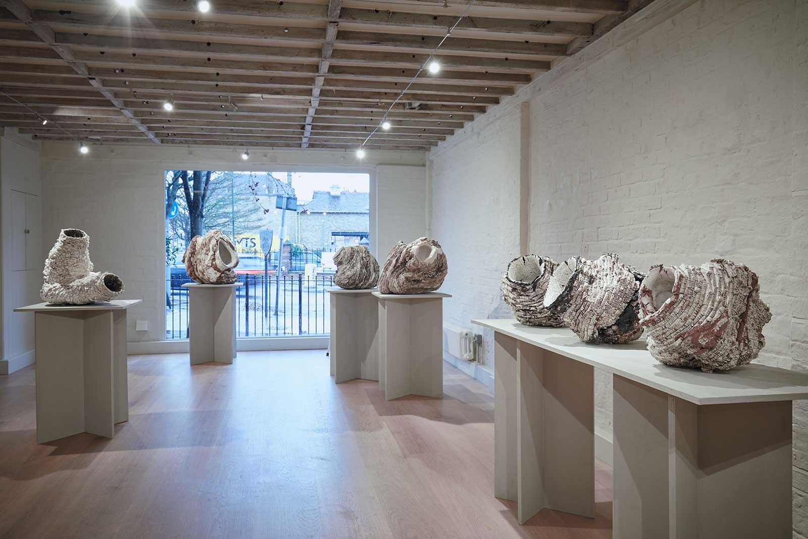
Exhibition view, ‘Luke Fuller: Terra-Form’
COURTESY: Sarah Myerscough Gallery
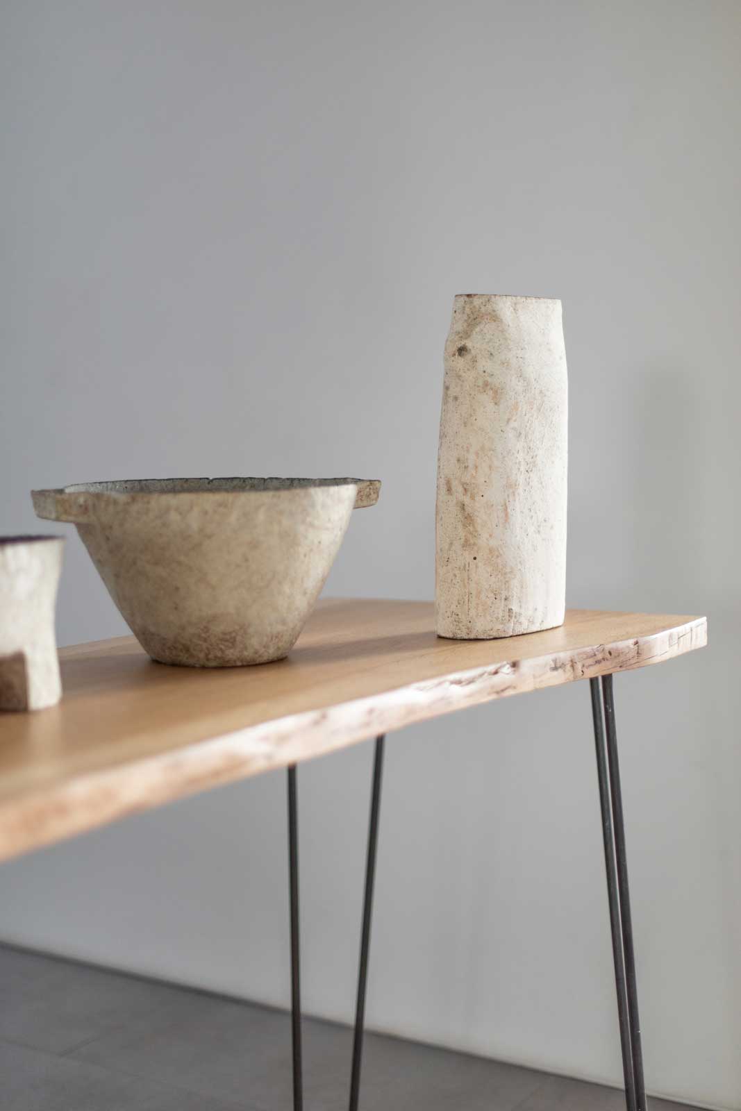
It’s something exemplified even more starkly at Flow Gallery in Westbourne Grove. Their show of Paul Philip ceramics is lovely.
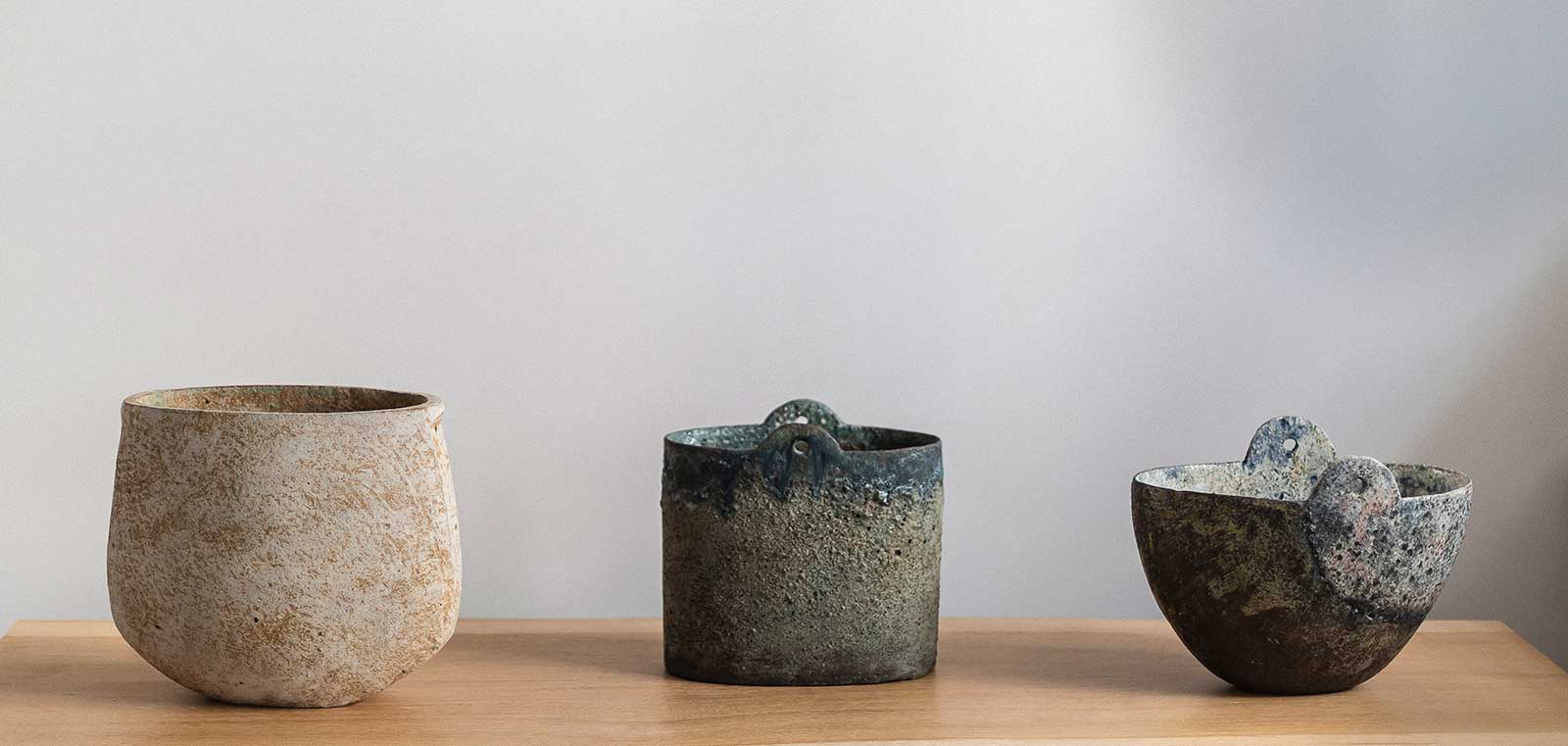
Exhibition view, ‘Paul Philip’
COURTESY: Flow Gallery
His works look like they’ve just been dug out of the ground, found in an archeological dig that’s struck on the lost works of some incredibly tasteful, ancient Roman ceramicist.
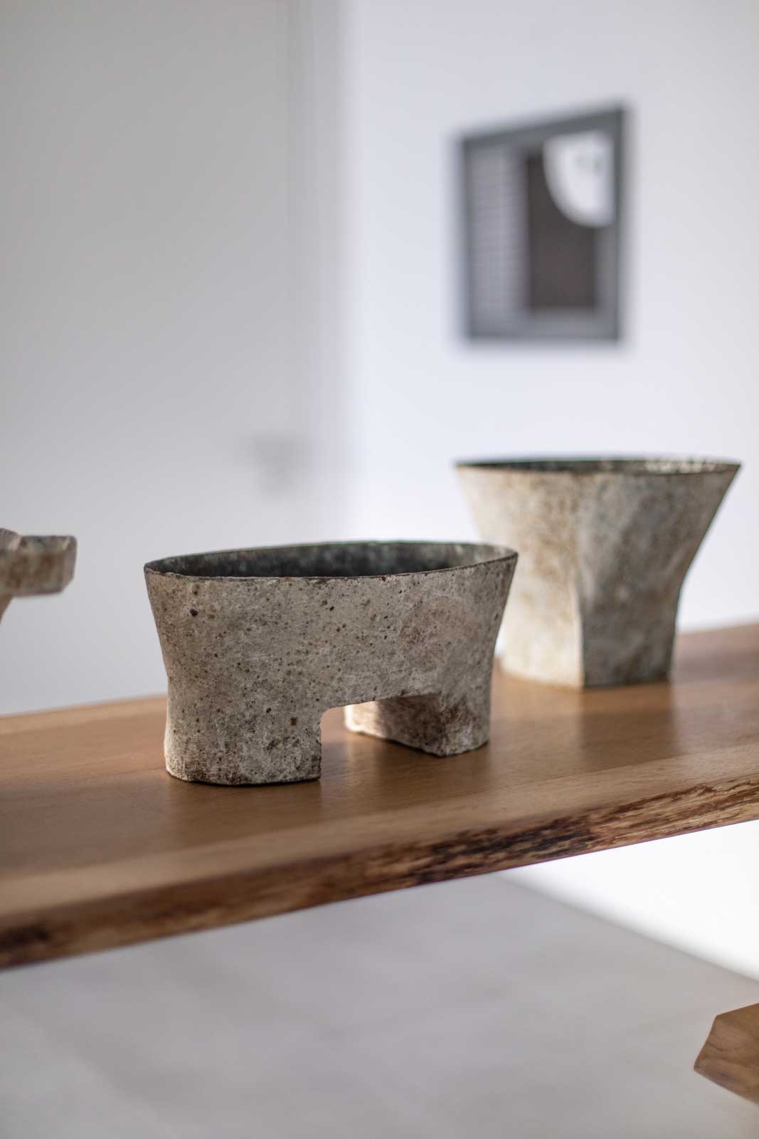
Exhibition view, ‘Paul Philip’
COURTESY: Flow Gallery
But right behind them is a towel rail for sale and maps of Notting Hill. It definitely changes how you actually look at things. That’s why the white cube, as a concept, not only exists, but works.
Exhibition view, ‘Paul Philip’
COURTESY: Flow Gallery
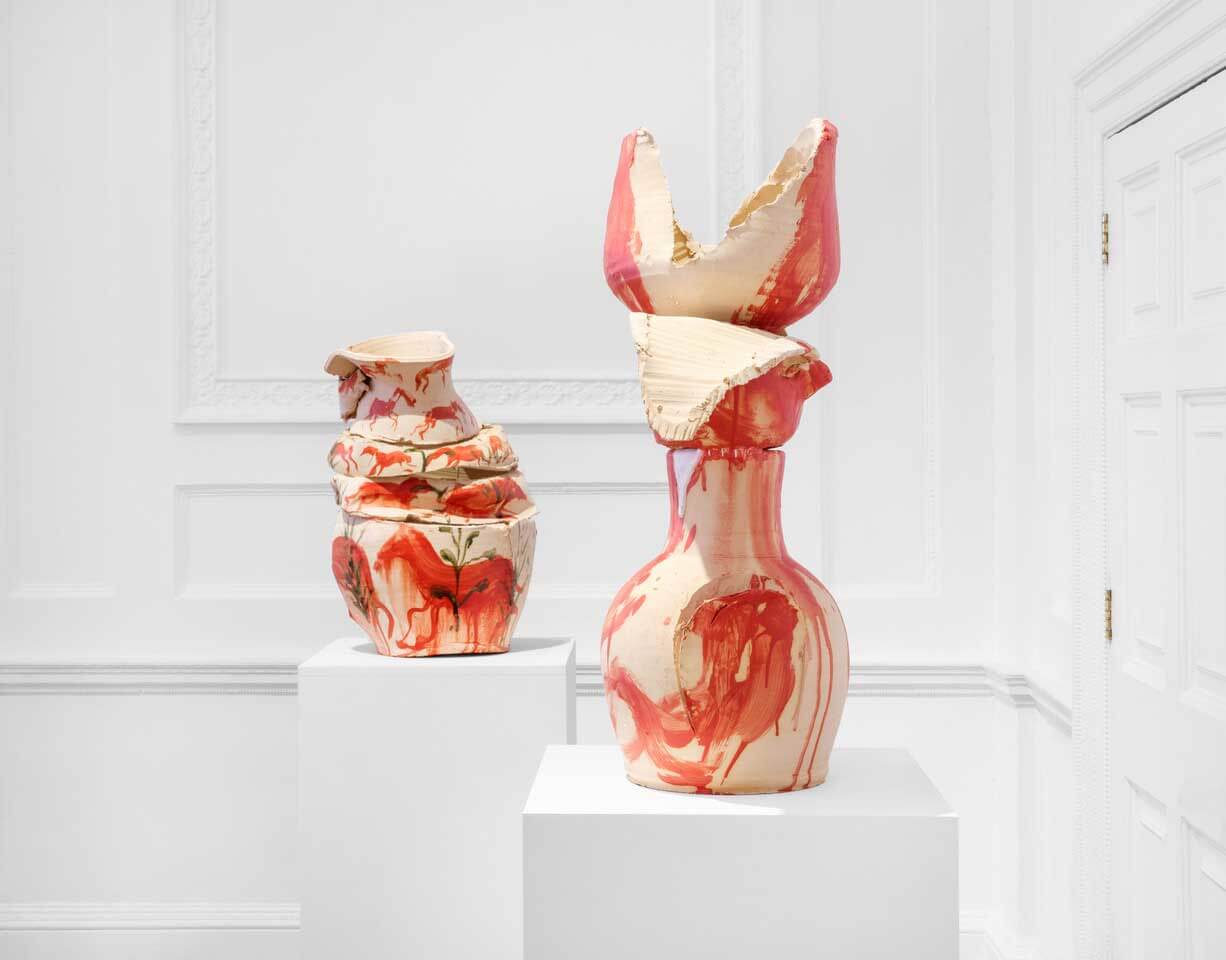
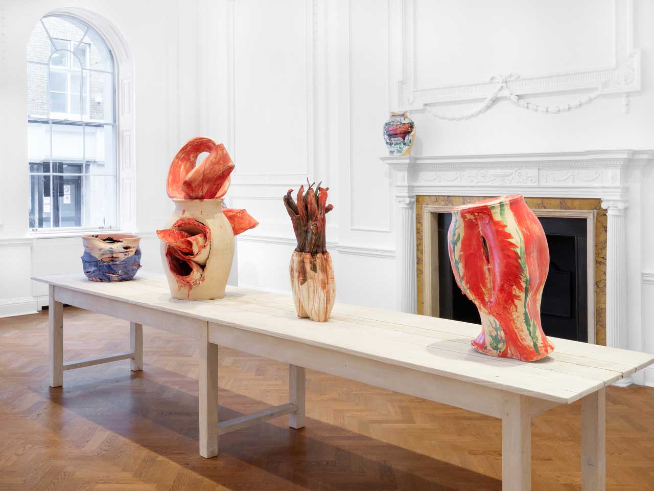
You want proof? Just go to Thaddaeus Ropac in Mayfair, one of the most successful contemporary art galleries in the world, housed in a giant, stunning central London mansion. They have a display of pots by Spanish artist Miquel Barceló in their first room; cracked ceramics with faces peering out of them, emblazoned with images of deep sea creatures.
Exhibition view, ‘Miquel Barceló: Ceramics’
COURTESY: Thaddaeus Ropac
Are these works any better, or more interesting, or more beautiful than Luke Fuller’s, or Paul Philp’s? Not necessarily, but despite being in the same material and intention, they’re presented as a higher form of art. They’re in a contemporary art gallery, not a design gallery and not a shop.
Exhibition view, ‘Miquel Barceló: Ceramics’
COURTESY: Thaddaeus Ropac
So you have all these conditions flying around – the acoustics of the space, the intention of the gallery, the feel of the room – which totally change the perception of the artwork. Those are all subtle things that have a huge impact.
But all of these issues get chucked right in the bin when you deal with something that’s intentionally more of an obvious showroom, because the pretence towards art is dropped and you can just take things for what they are.
Jean Cocteau, ‘Orphee à la Lyre’ tapestry, designed late 1950s
COURTESY: Themes & Variations
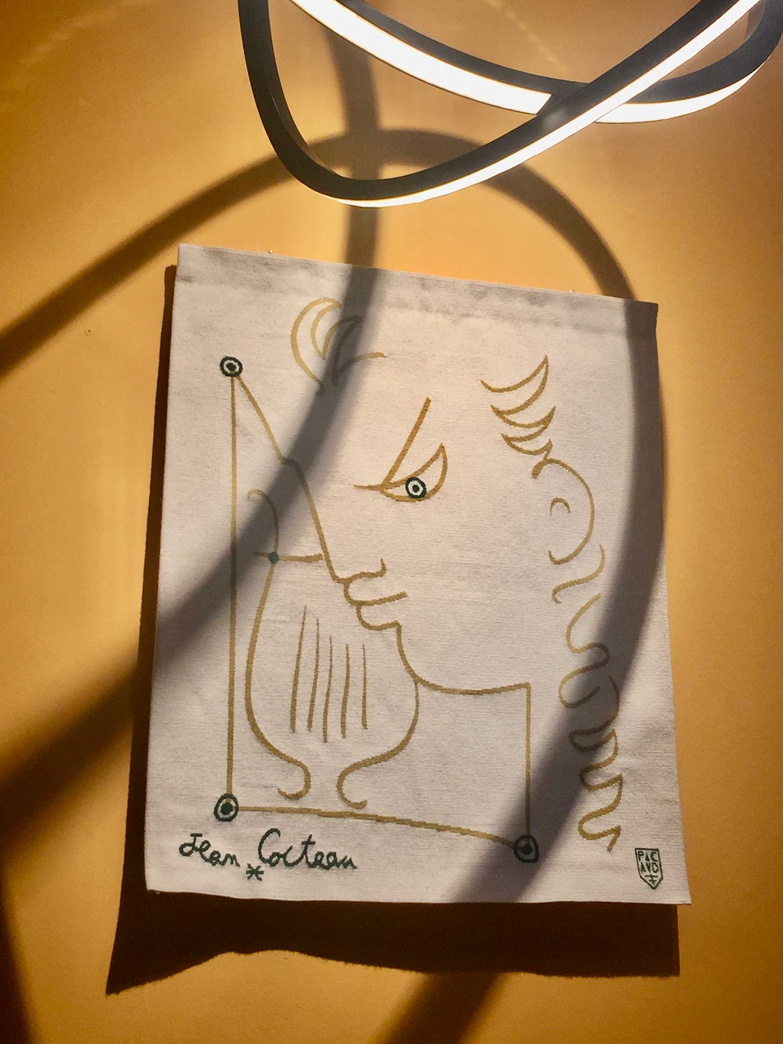
Themes & Variations in Westbourne Grove have some stunning things on display, including a Jean Cocteau tapestry and some very iconic Geoffrey Harcourt armchairs that look more than worth the inevitable lumbar pain. The Dmitry Oskin butterfly images on the other hand are worse than anything Damien Hirst has ever done to a butterfly, and that’s really saying something.
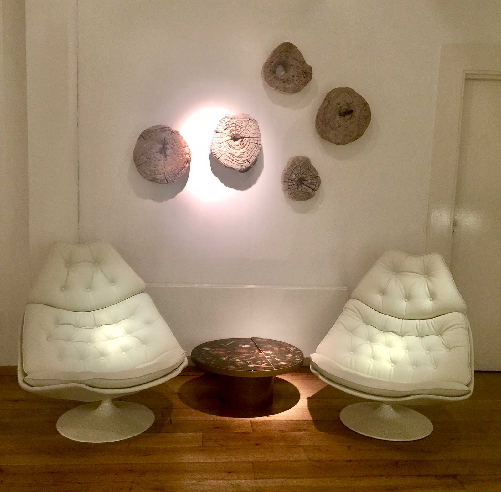
Geoffrey Harcourt, ‘Pair of F588 Chairs’, circa 1960s
COURTESY: Themes & Variations
Down the road at Nordic design purveyors Modernity, they’re celebrating Rune Hagberg and Per Hammerström in their big, airy space, though the real gold is a handful of Alvar Aalto dining sets that are jaw-droppingly perfect.
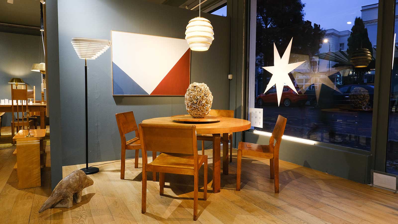
Alvar Aalto for Finmar Ltd, Finland, ‘Dining Set’, 1929-1935
COURTESY: Modernity
But if you can feel your credit card starting to burn a hole in your wallet at the thought of a new dining table, just head to the Design Museum’s ‘Waste Age’ show, a brutally cold shower for the consumerist in all of us. The exhibition starts out by throwing endless facts at you about waste and pollution and how we’re destroying the planet with plastic. It hits hard, and it hits over and over again. A wall of beautiful Edward Burtynsky photographs of rubbish dumps and tyre graveyards just rams it all home.
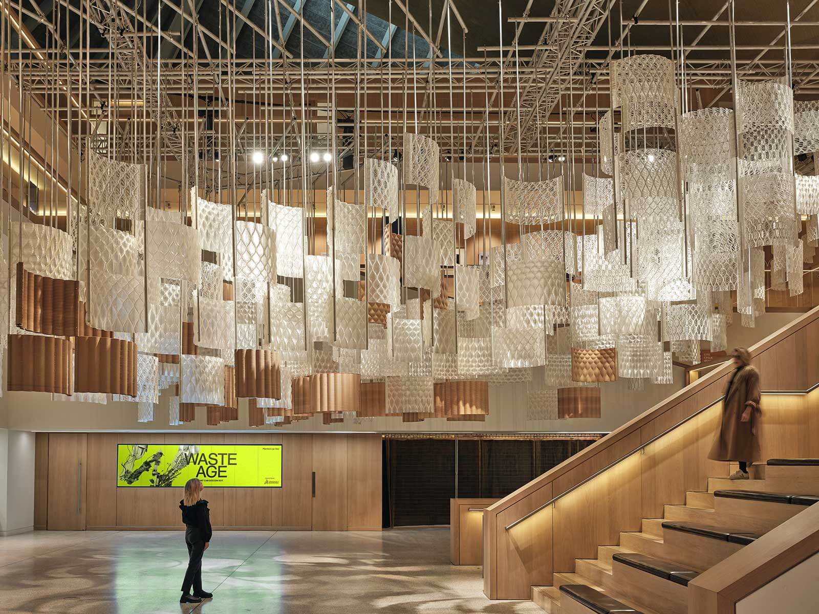
Exhibition view, ‘Waste Age: What can design do?’
COURTESY: The Design Museum
But it’s also the Design Museum, and they just can’t hold themselves back from celebrating plastic design. A neoprene Prada raincoat, Joe Colombo’s amazing Universale stacking chair, bike helmets, syringes, airbags … what’s the message here? Is plastic … good? Stop messing with my heart, Design Museum.
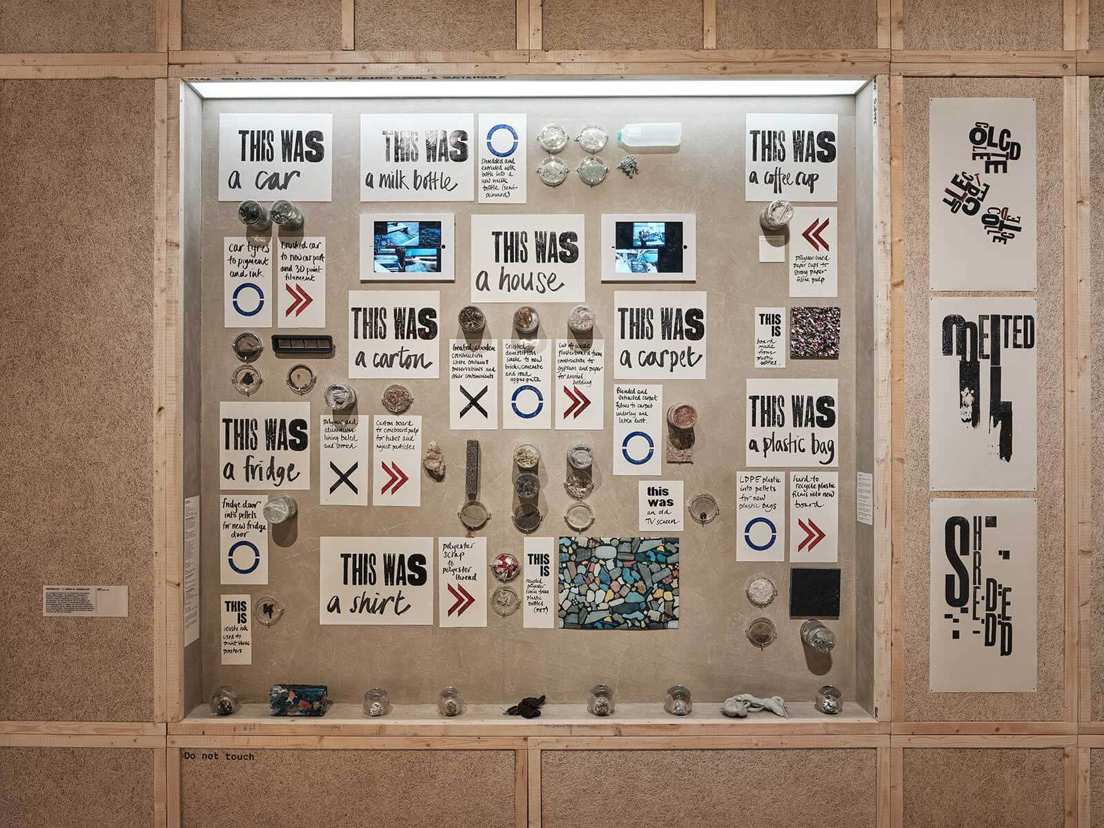
Exhibition view, ‘Waste Age: What can design do?’
COURTESY: The Design Museum
The best bit of the show is focused on products made from recycled plastic. Stacked Jasper Morrison chairs, a Stella McCartney hoodie made of Nucycl, insulated bricks. The show’s great, a powerful attack on consumerism gone wild. It forces you to put all the other bits of design on display in London this winter in context, makes you reconsider what it is you want and need out of the objects you covet.
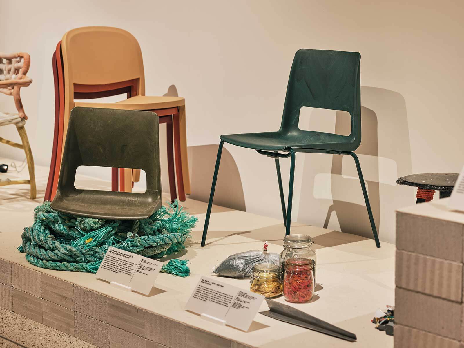
Exhibition view, ‘Waste Age: What can design do?’
COURTESY: The Design Museum
But it’s also a show with hope, a show that gives you a glimpse of a potential future where we haven’t destroyed the planet, where we use resources carefully, recycle committedly. A future where we all wear really chic Stella McCartney hoodies and no one needs ambient music.
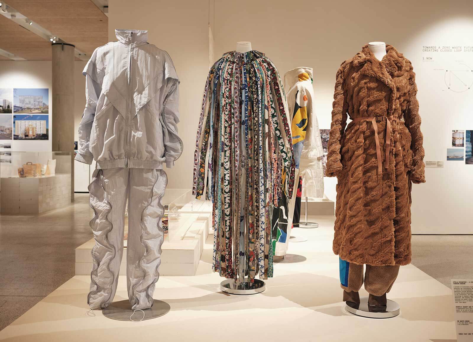
Exhibition view, ‘Waste Age: What can design do?’
COURTESY: The Design Museum
Together – The Power of Collaboration at Gallery FUMI.
Luke Fuller: Terra-Form at Sarah Myerscough Gallery runs until 29th January, 2022.
Paul Philip at Flow Gallery runs until 25th February, 2022.
Miquel Barceló: Ceramics at Thaddaeus Ropac runs until 5th February, 2022.
Waste Age: What can design do? at The Design Museum runs until 20th February, 2022.
