
 9th March 2021
Screenshots from the online world
March 2021
STUCK IN MONTH 11 of the national lockdown, the only solace many of us can find is in the digital world. Doom-scrolling Twitter, trawling eBay, pretending to enjoy Zoom quizzes, watching just one more episode of some Australian reality show and then watching just one more. When the world is such a mess, is there anything really all that wrong with simply spending a bit of time on the World Wide Web?
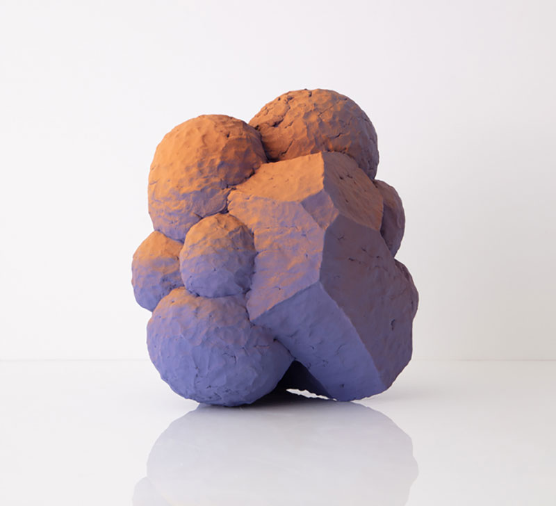
John Shea, ‘Peeper’, 2019
COURTESY: Hostler Burrows & Collect
Yes, there is. A lot, apparently. That’s according to Italian design duo FormaFantasma, who have taken it upon themselves to make you feel guilty about the only joy you can possibly feel in 2021. Their new website, created in collaboration with Studio Blanco, “has been designed to minimise the energy consumption and CO2 emissions that result from navigating the internet.” You see, just by reading this word right here – abacus – you’re consuming energy, and destroying the planet. It’s an idea that fits neatly into their design ethos – using their work to ask big questions about ecology – and it’s an interesting project: getting rid of the bits of a website that load in the background and prioritising colours and fonts that consume less power. The result is, unsurprisingly, a minimal and entirely unfussy website.
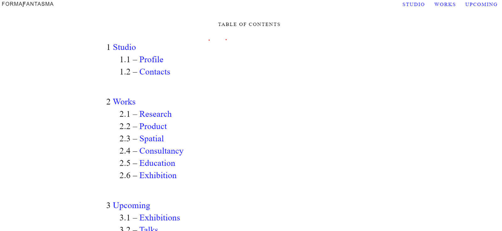
FormaFantasma’s homepage
COURTESY: FormaFantasma
It’s something worth considering as you trawl through the V&A’s new digital portal – a genuinely impressive example of how to digitise a collection – because you might end up spending an awful lot of time, and electricity, here. The rest of the world’s museums should take note, because this is an in-depth, carefully assembled, clearly written and easy-to-navigate website.
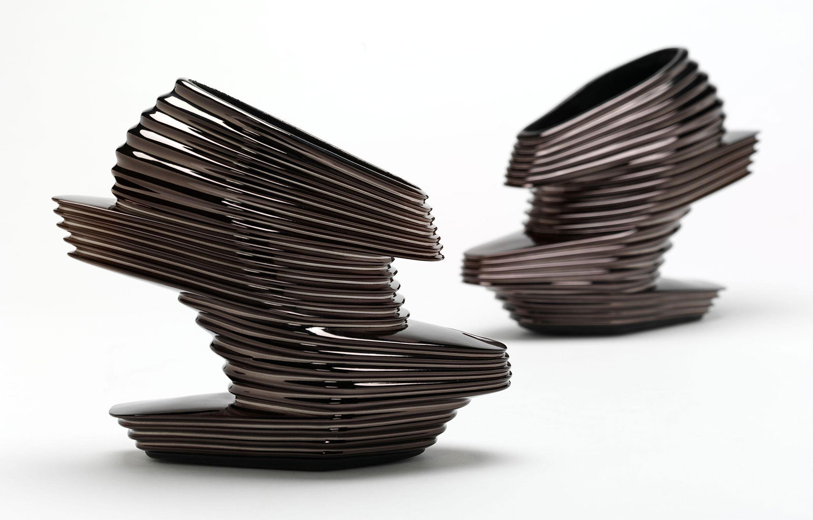
Zaha Hadid for United Nudes, ‘Nova Shoes’, 2013
COURTESY: © V&A
There are mini-essays on things like Zaha Hadid’s beautifully headache-inducing shoes for United Nudes and the political implications of a pair of black Primark jeans; there’s an illustrated guide to the prison embroideries of Mary, Queen of Scots, and a look at the world’s first 3D printed gun. It’s exhaustive, brilliant and perfectly diverting. This is what we should expect from a major museum or gallery website in 2021: not just pretty photos, but stories, ideas and information presented in new, innovative ways. There’s stuff for casual observers through to hardened designophiles – and everything in between. A proper wealth of information and beauty.

Cody Wilson/Defense Distributed, ‘The Liberator’, 2013
COURTESY: © V&A
Another big project was this year’s Collect art fair, this time featuring 32 galleries and over 400 artists selling their wares, alongside a programme of talks, all presented on the art selling website Artsy. There were some gorgeous artworks available. American gallery Hostler Burrows presented a selection of minimal, austere and very, very beautiful objects, including some dusty, blobby, geometrics by American artist John Shea and bodily vases by Finnish ceramicist Kristina Riska.
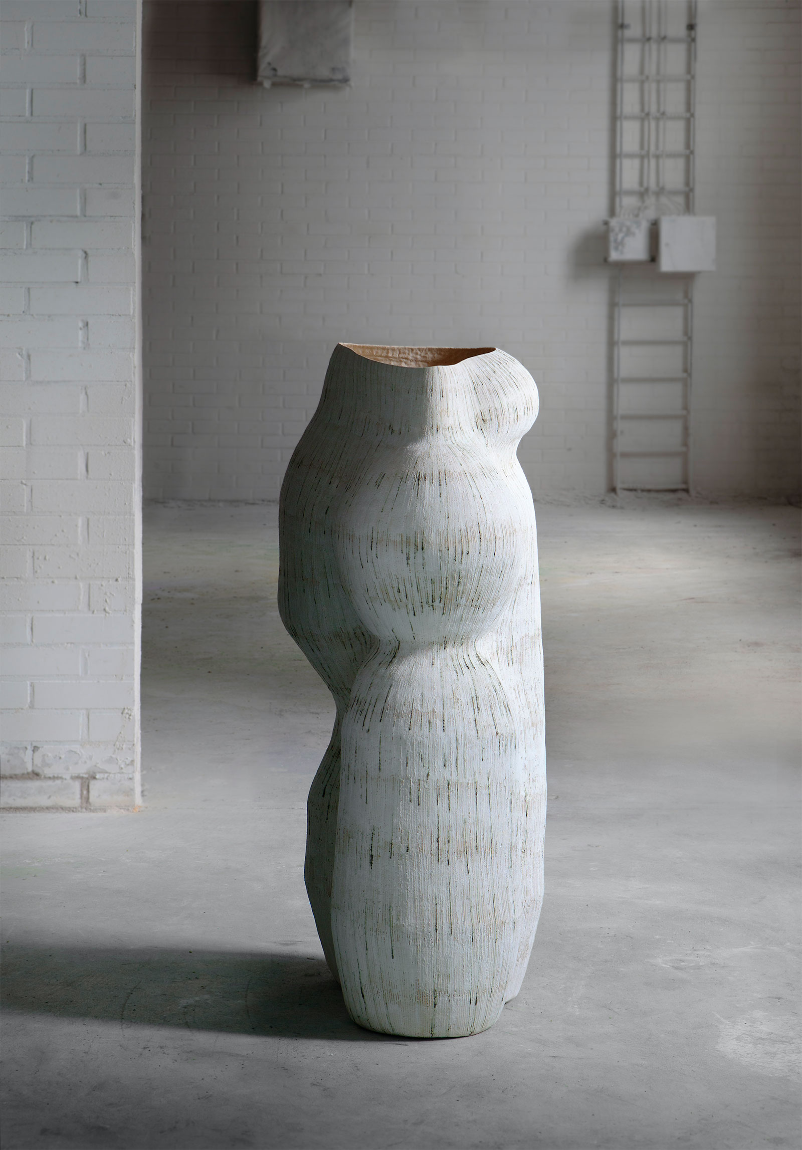
Kristina Riska, ‘Harmony of Growth’, 2019
COURTESY: Hostler Burrows & Collect
Gallery TEN, meanwhile, brought a dizzying array of glass works by the likes of Juli Bolaños-Durman and Edmond Byrne. Joanna Bird Contemporary Collections also had some impressive works, including a perfect little Bernard Leach owl bowl.
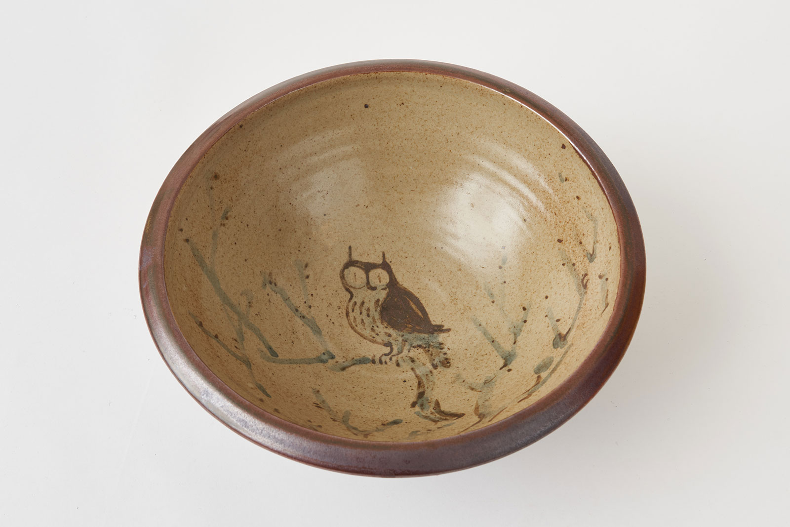
Bernard Leach, ‘Owl Bowl’, circa 1950s
COURTESY: Joanna Bird Contemporary Collections
What’s interesting about putting a digital art fair on a platform like Artsy is that prices and sale status are, largely, unhidden. It’s open and honest in a way that art and design fairs rarely manage to be – and that serves to make the whole thing feel more accessible, less elite. It also means you can treat the whole thing like any other selling website and sort all the works by price or date, which is fun. The cheapest thing for sale was a €250 heart-shaped brooch by Veronika Fabian at Galerie Marzee, while at the other end of the spectrum was an £80,000 tapestry by Barbara Rae from Dovecot Studios. Something for everyone, as long as everyone has lots of money.
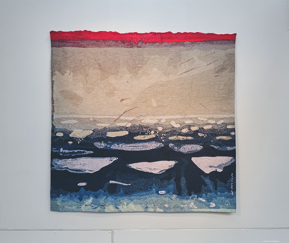
Barbara Rae, ‘Peel Sound Ice’, 2019
COURTESY: Dovecot Studios & Collect
But there’s a problem with putting the whole fair on a platform like Artsy. It makes everything easier and more accessible, sure, but it also makes it clear that this is about selling and profit, not about ideas and aesthetics. You can walk around Frieze or PAD and pretend there’s some great big artistic intention behind everything you see, but when the selling is as blatant as it is here, no amount of articles about ‘How Craft Became an Art Market Force’ or talks with Edmund de Waal will make you feel like you’re not just scrolling through a high-end Argos website.
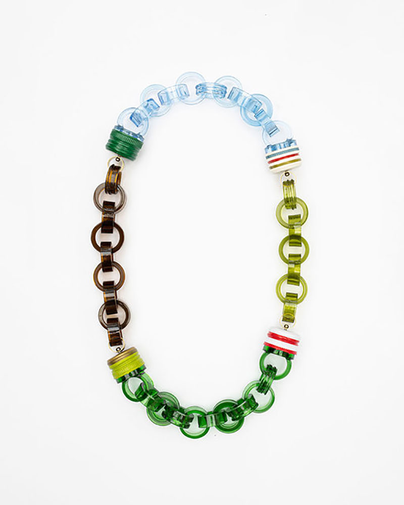
Veronika Fabian, ‘A Long Night’ necklace, 2021
COURTESY: Galerie Marzee & Collect
Away from the big museums and major fairs, there was plenty happening online at smaller galleries around the world. There was a show of performance art pillows (naturally) by young artist Lukas Gschwandtner at Maniera Gallery in Brussels, for example, and an exhibition at Nilufar of technicolour tables by French-Lebanese artist Flavie Audi, that you wouldn’t dare put a beer on.
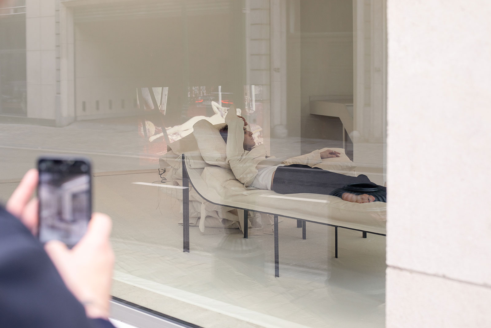
Installation view of Lukas Gschwandtner’s ‘Pillow Portraits’, 2021
COURTESY: Maniera © Jeroen Verrecht
But the problem with all of these smaller ‘viewing room’ experiences is that, for the most part, they’re just some photos on a website. At the start of the pandemic, galleries were putting huge amounts of effort into figuring out how to make visiting their websites worthwhile, but as we – hopefully – near the end of this whole palaver, it feels as if the wind has dropped out of the online exhibition sails a little. If virtual exhibitions are going to continue to be a thing, they’re going to need to have more effort put into them to be successful.
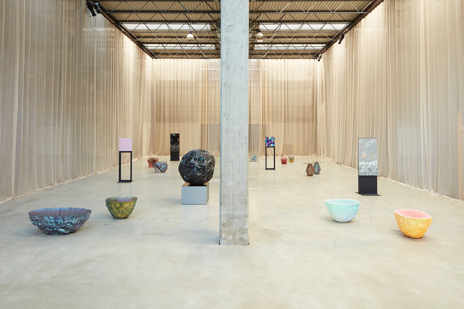
Installation view of Flavie Audi’s ‘TERRA (IN)FIRMA’
COURTESY: Nilufar
The online shows at Carpenters Workshop Gallery and Demisch Danant were better, though. The first provided a video walkthrough of the space, while the second hosted an interactive 3D tour. Going to that extra bit of effort means that viewers can begin to grasp how the objects feel and look in the real world. Tours and walkthroughs give exhibitions spatial context, and that’s hugely important.

Floor plan of Demisch Danant – part of their Virtual Tour of ‘A Harmony of Things’
COURTESY: Demisch Danant
But as the end of COVID-19 nears, we hope, galleries seem less and less willing to go that extra digital mile: there’s a real odour of web fatigue in the air right now. Which is bad news for galleries, but great news for the planet.
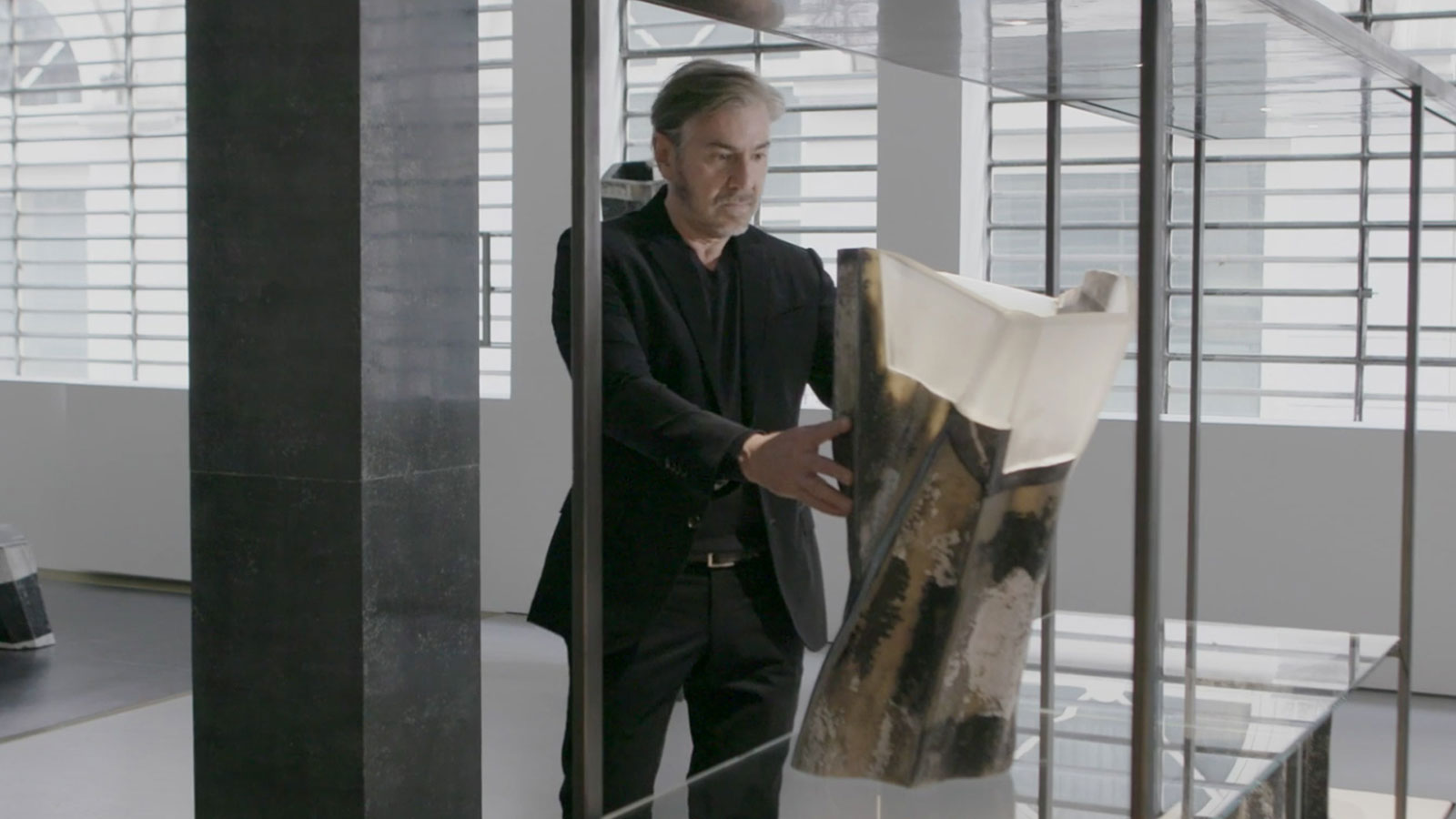
Still from the film tour of Vincenzo de Cotiis’s exhibition ‘Crossing Over’
COURTESY: Carpenters Workshop Gallery
