Curating Design
MAK’s bold move to hand over curatorship to contemporary artists has left a powerful legacy.
IT’S RARE FOR a museum to allow contemporary artists, rather than their own curators, to install their permanent collections. Rarer still for the results to last for 25 years. But that is the situation at the Museum für Angewandte Kunst (Museum of Applied Art, or MAK) in Vienna. When I was in graduate school, I visited this institution and was amazed to see that it had given the run of the place to artists – including three Americans (Barbara Bloom, Donald Judd, and Jenny Holzer) – following a renovation of its historic building. That encounter was a dramatic influence on my thinking as a young curator. I returned earlier this year, and the installations were still there, looking better than ever.
The MAK collection is highly important, having its roots in the Imperial Royal Austrian Museum of Art and Industry, founded in 1864 in approximation to the South Kensington Museum in London. But it’s the artist-designed galleries that make it one of the world’s greatest design museums. They were the brainchild of Peter Noever, who directed the MAK from 1986 to 2011. Noever is a controversial figure, equally at ease as an architect, historian, and avant garde provocateur. (One of his last acts at the museum was an exhibition about design in North Korea, entitled ‘Flowers for Kim Il Sung’.) He departed under a cloud of allegations about misappropriation of public funds, with a particular point of controversy – you can’t make this stuff up – being a series of birthday parties he’d held at the museum for his own mother. These were actually institutional fundraisers, but such outlandish manoeuvers drew the ire of government figures, who maligned Noever as (in the words of critic Jens Kastner) “a grand master of wastefulness and nepotism.” Luminaries of the art and design world offered public support, from Christo to Zaha Hadid. Perhaps the most elegant comment came from Hernan Diaz Alonso, of the futurist architecture firm HDA-x, who quoted Cervantes: “Be quiet, when the dogs bark it is because we are working.”
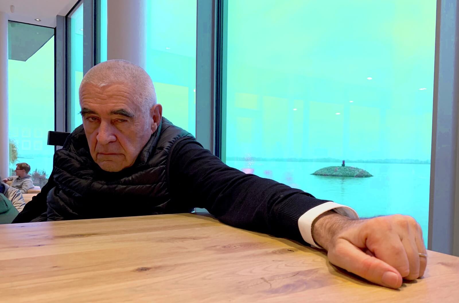
Peter Noever
COURTESY: © Louisa Vita Noever
In a way it was appropriate that Noever went down in a hail of reactionary gunfire, because his tenure had been unswervingly devoted to confrontation. Somewhat counterintuitively, it was his position in a decorative art museum that allowed him to do this. Even in relatively conservative Austria, it was hard to see what else artists could do to shock the bourgeoisie. The Viennese Action School of the late 1960s, in which figures like Valie Export, Hermann Nitsch and Rudolf Schwartzkogler engaged in public nudity, sexual acts and self-mutilation, had long been absorbed into the canon. But to do weird things with the nation’s baroque furniture? That was something else.
Even in relatively conservative Austria, it was hard to see what else artists could do to shock the bourgeoisie
It’s interesting, too, to note that MAK’s artist galleries opened within a year of Fred Wilson’s influential exhibition ‘Mining the Museum’, at the Maryland Historical Society. Still probably the best-known of all artist interventions, this project used material culture to trenchantly critique seemingly neutral historic collections. Wilson presented slave shackles alongside plantation-quality silverware with the simple caption: ‘Metalwork 1793-1880’. He put a Ku Klux Klan hood face-up in a baby carriage. Revival chairs were arranged, theatre-like, facing a whipping post: ‘Cabinetmaking 1820-1960’. It was precisely the muteness of the objects that allowed Wilson to be so eloquent with them.
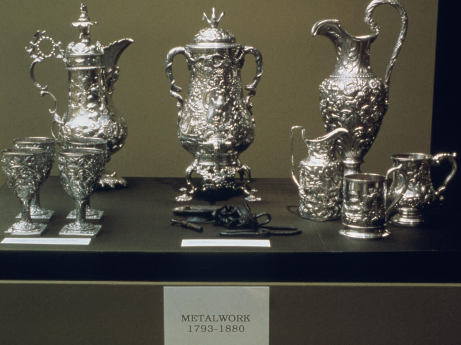
Fred Wilson, ‘Metalwork 1793-1880’, installation 1992-3
COURTESY: Maryland Historical Society
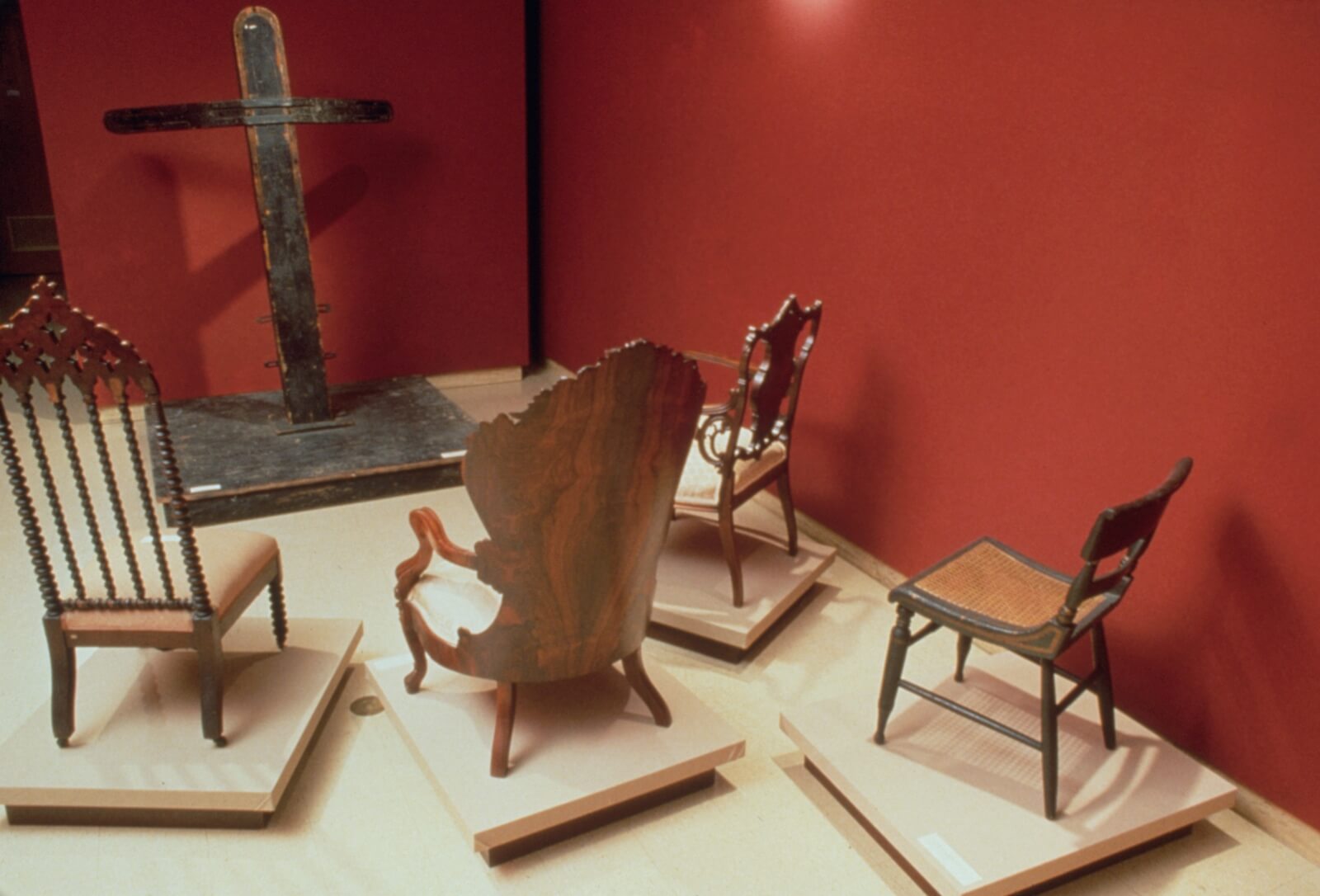
Fred Wilson, ‘Cabinetmaking 1820-1960’, installation 1992-3
COURTESY: Maryland Historical Society
‘Mining the Museum’ lasted only eleven months, unfortunately, but the MAK installations remain, a reflection of the investment that originally went into them. Barbara Bloom recalls that “no time and intelligence and expense was spared” on the important occasion of the museum’s reopening. While not as politically radical as Wilson’s project, they cumulatively suggest the limitations of most other applied art displays, which are often so stiff as to be lifeless. Abiding by an unwritten (and unexamined) principle that objects look best when allowed to “speak for themselves”, most curators place historic and contemporary design either on bare platforms, or in period rooms. It seems not to occur to them that this is like putting actors on a stage without a script. At the MAK, by contrast, objects are arranged into surprising scenarios that prompt – and almost demand – an inquiring response. This principle was important not only to Noever, but the curator who worked directly with the artists on the installations, Christian Witt-Dörring. In a recent interview, he told me that the goal had been to avoid making an experience to be passively consumed, but instead a space in which visitors would have to form their own opinions. To some extent, too, he felt liberated by the over-familiarity of the objects to be displayed, “we thought, it’s not necessary to give a chronological survey anymore, as in the 19th century. People travel. So we emphasised things specific to Vienna, and these are not exotic flowers for us.”
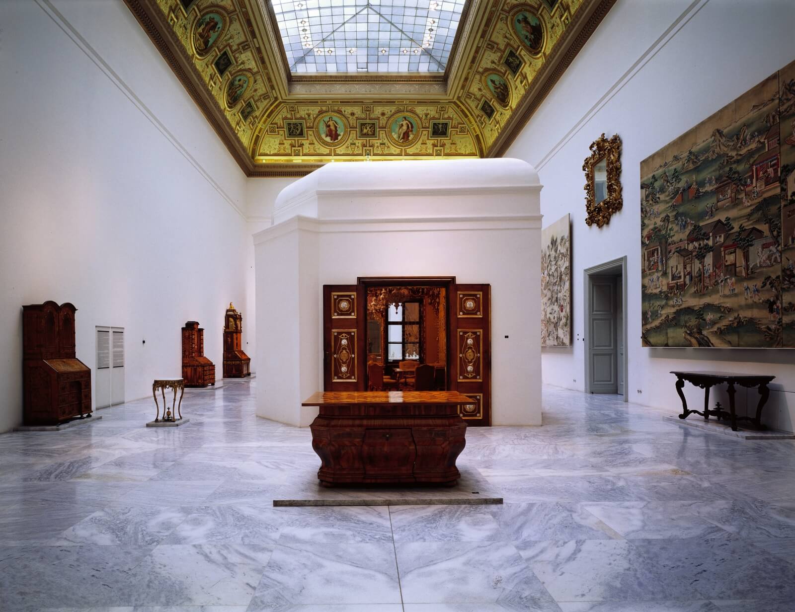
Donald Judd, ‘MAK Permanent Collection Baroque Rococo Classicism’, artistic intervention, circa. 1990s
COURTESY: © Gerald Zugmann/MAK
THE MOST INSPIRED pairing of artist and collection was that between Donald Judd and the MAK’s baroque and rococo holdings, a powerful collision of two antithetical idioms: Judd’s über-restrained Minimalism, and elaborately overstated historic pieces. Judd was also an ideal choice because of his own involvement in furniture. He had created planar beds, benches, tables and other forms since the 1960s, initially for his own use, and eventually with an eye toward limited serial production. Judd brought to his functional designs the same combination of relentlessness and rationality that he brought to his sculpture. Yet he saw the two fields as utterly discrete. “The configuration and the scale of art cannot be transposed into furniture and architecture,” he famously wrote. “The intent of art is different from that of the latter, which must be functional. If a chair or a building is not functional, if it appears to be only art, it is ridiculous.”
Judd held fast to a parallel division in his approach to the MAK commission, treating artistic and curatorial matters like oil and water, meant to remain unmixed. Witt-Dörring provided him an initial checklist – as he did for all the artists involved – and Judd simply began planning the space, beginning with the largest thing to be displayed: a whole room. This was a chamber from the Palais Dubsky in the Czech city of Brno, completed in the 1740s and decorated with porcelains made by the Vienna firm Du Paquier. Judd seems to have regarded this glorious interior somewhat balefully, as “the installation’s set fact … I was told there was no alternative.” His first move was to place the room dead-centre within the gallery, allowing for circulation round it. He then asked for it to be sheathed in a cleanly articulated white volume, which seems to act as a translator in the physical conversation between the intricate chamber within, and the shape of the gallery without.
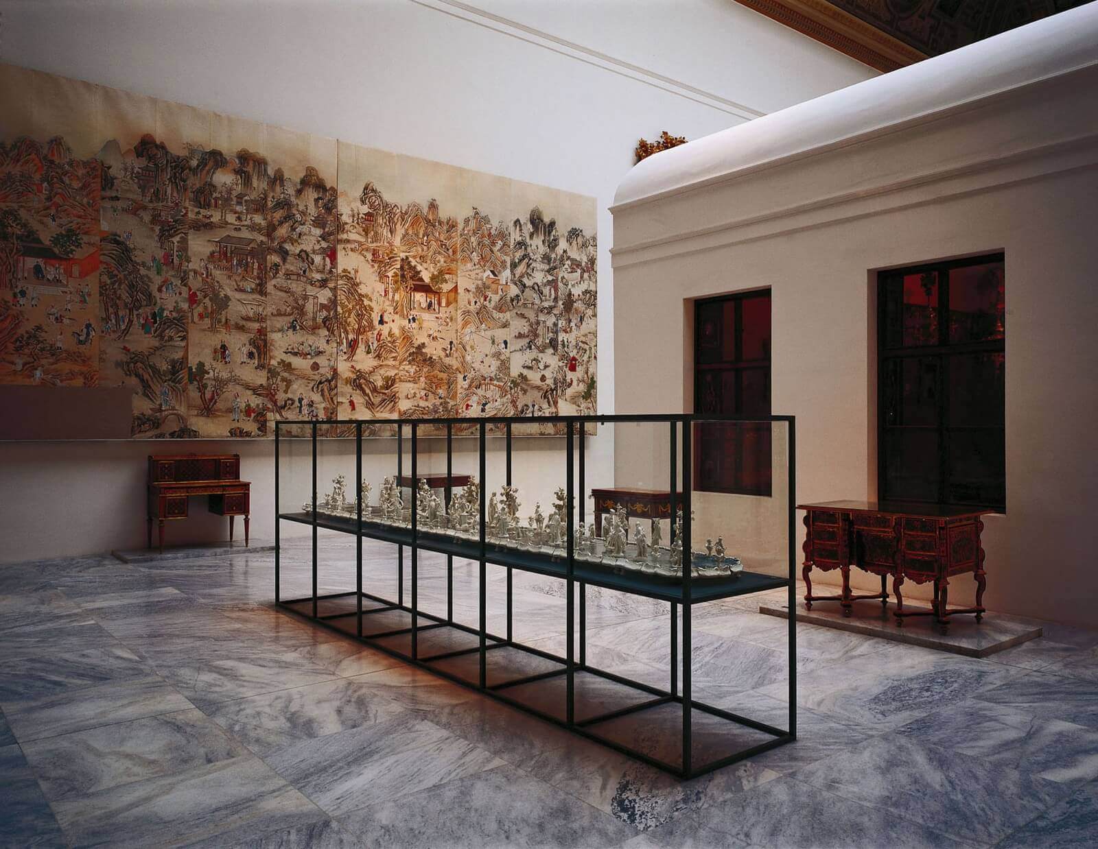
Donald Judd, long vitrine with table centrepiece from Zwettl Monastery Vienna, 1768 and earlier
COURTESY: © Zugmann/MAK
Another component of Judd’s gallery is a long vitrine, containing a porcelain tableau in the rococo style. When the film-maker Amie Siegel (best known for her documentary on Le Corbusier furniture, ‘Provenance’) gave a spellbindingly detailed lecture on Judd’s work as a designer in 2016, she placed particular emphasis on this display case. She noted that as the only display case he ever made, it was a “singular object” in his oeuvre, and that its regular compartmentalised structure contrasted with “the excessive length and temporal unfolding of the object it contains.” As in his treatment of the Dubsky room, Judd had created a space within a space, “which holds in stillness its still object.” Witt-Dörring shares this perception, recalling that when he first saw Judd’s proposal for the vitrine, “I at first thought, what is he doing? We don’t want it divided by panels.” When he saw the porcelain installed within, however, “it was a revelation – the first time it came alive. One opposite explaining another, lively rococo shapes and a dark grid.” Despite (or perhaps because of) its uniqueness, the MAK installation deserves to be ranked as among Judd’s most fascinating sculptural propositions. About the only person who seems not to have been entirely satisfied was Judd himself. “I was doubtful about the idea of artists making installations of earlier objects,” he said. “I am still doubtful.”
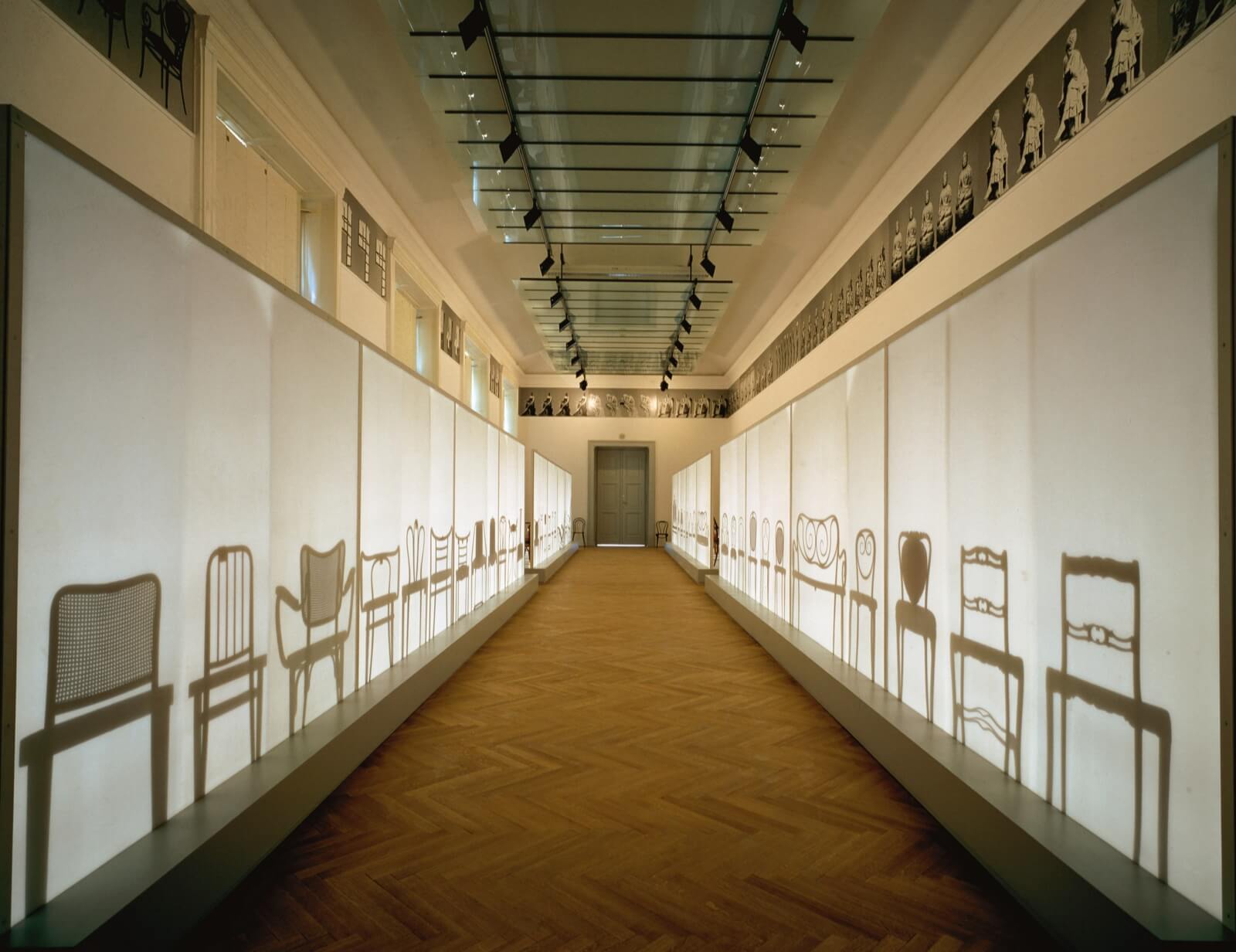
Barbara Bloom, ‘MAK Permanent Collection Historicism, Art Nouveau’, artistic intervention, circa. 1990s
COURTESY: © Gerald Zugmann/MAK
No such uncertainty troubled Barbara Bloom, who created the other truly iconic installation at the MAK, a display of bentwood furniture by the Viennese firm Gebrüder Thonet. Unlike the other artists involved in the installations, who were assigned a part of the collection, she specifically asked to work with a group of objects, which captured her imagination for their foundational position in histories of modernism. Thonet was among the very first companies to engage in mechanised mass production of furniture, and developed a distribution scheme to match, with widely distributed sales catalogues, inviting customers to pick out their furniture from a line up. Aesthetically, too, it’s possible to draw a forward arc from their reductive designs to Mies Van Der Rohe’s dictum “less is more”. “Take the story to its logical conclusion,” Bloom notes, “and you get to IKEA.”
Bloom was also struck by the fact that these objects look like drawings in space, a linearity all the more noticeable in the catalogues, which have page after page of variously curled chairs. With this in mind, she positioned the chairs on two long platforms, each backed by a scrim. Walk down the gallery’s side aisles, and you see a succession of Thonet chairs and settees; walk down the centre, and you see only their silhouettes. As she notes, “each chair almost makes a logo of itself.” To further stress the comparison to IKEA, she also gave each chair a person’s name, drawing from characters in period Viennese texts, by writers like Sigmund Freud and Karl Kraus. And, in a final clever twist, Bloom also asked the museum to provide cheap Thonet knockoffs for the gallery guards to sit in. The room is full of valuable originals, but the only chairs actually in use are inauthentic. Taken as a whole, the room suggests not only a certain inexorable logic within design history, but also, perhaps, within museums themselves: as objects gradually migrate from their original contexts, they are transformed into symbols, shadows of their former selves.
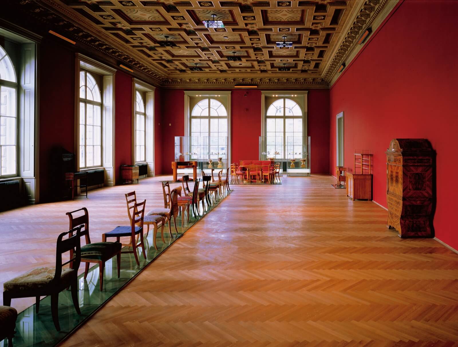
Jenny Holzer, ‘MAK Permanent Collection Empire Style Biedermeier’, artistic intervention, circa. 1990s
COURTESY: © Gerald Zugmann/MAK
THOUGH NOT QUITE as indelibly memorable as Judd and Bloom’s galleries, Jenny Holzer’s room of Biedermeier furniture also holds up well. She deployed her signature LED signs, which carry both label information and passages selected from early 19th century texts, which Witt-Dörring provided to her to select from. Showing her astute understanding of the general public, she planned for a variety of different kinds of visitors. Those who were particularly keen to learn are offered a cast aluminum sofa in Biedermeier style in which to sit – a powerful design object in its own right – and read all the information as it flashes by. But, “because some people hate to read in museums,” Holzer said, “I placed the signs near the ceiling so they can be ignored.”
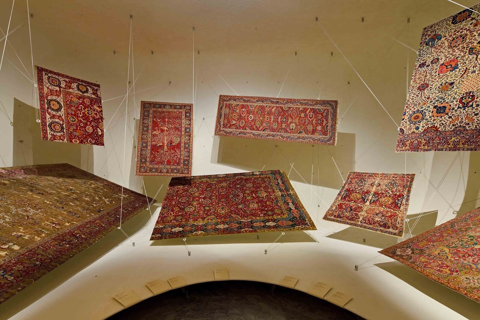
Michael Embacher and Füsun Onur, ‘MAK Permanent Collection Carpets’, artistic collaboration, 1993
COURTESY: © Rupert Steiner/MAK
Much to its credit, the MAK has returned to the spirit of Noever’s installations in recent years. Designer Michael Embacher collaborated with the Turkish artist Füsun Onur to refresh the 1993 installation of the museum’s fabulous collection of carpets (Ottoman, Safavid, and European), which are suspended as if they were playing cards caught mid-trick. There is an obvious nod here to the idea of the flying carpet, but also a more nuanced historical message about these artifacts, which were once among the most valuable form of portable wealth. And then there is an absolutely sensational installation by Tadashi Kawamata, featuring his signature deconstructivist woodwork, tumbling around glassed-in compartments which hold treasures from the MAK’s East Asian collection. Labelling is kept to a minimum – written by hand right on the glass. Amazingly, Kawamata persuaded the curators to set out the objects right on the floor, in stacks. Plate glass sheets sit right on top of historic ceramic vases, which then support further vases on top. The overall effect is provisional, precarious, even violent, communicating the idea of objects caught up in the maelstrom of history.
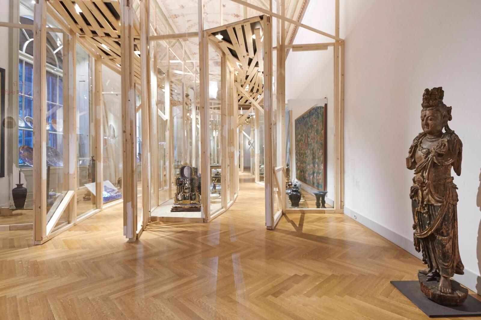
Tadashi Kawamata, ‘MAK Permanent Collection ASIA: China – Japan – Korea’, artistic intervention, 2016. ‘Bodhisattva, China, Song dynasty’, 960–1279 (foreground).
“I HAVE LEARNED more from working with contemporary artists than by going to university,” says Witt-Dörring. American audiences may be familiar with his ravishing exhibitions at the Neue Galerie, most of which have focused on the fin de siècle; when I was in Vienna, the MAK had on view his most recent project, a monographic show on the supremely talented artist and designer Koloman Moser, who created many of the most elegant and enduring works of the Wiener Werkstätte. Working in a cavernous space at the top of the museum, and with a relatively limited budget, Witt-Dörring worked a little like an artist himself. Moser’s technical drawings (no masterpieces, but interesting to compare to the objects) are mounted in oversized A-frames with magnets, suggesting a studio atmosphere. The overall effect was informal, offering a direct encounter with Moser’s process. “If you have little money,” Witt-Dörring told me, “it’s very often helpful.”
Many museums have allowed artists into their permanent collections to great effect – among them the mighty V&A, the Jewish Museum and the Musée de la Chasse et de La Nature
As for the legacy of the MAK displays outside Vienna, it is difficult to say. The balkanisation of large museums, with their separate departments, and the narrowness of the decorative art field, militate against the adventurous approach that came so naturally to Noever. On the other hand, many museums have allowed artists into their permanent collections to great effect – among them the mighty V&A, which commissioned an installation from Elmgreen and Dragset a few years back; the Jewish Museum, which brought in Barbara Bloom herself for a collections-based exhibition in 2013; and the Musée de la Chasse et de La Nature, in the Marais neighbourhood of Paris, which has a permanent installation of artist-designed vignettes starring taxidermy animals. The over-the-top theatricality of the Costume Institute at the Metropolitan, in combination with its equally over-the-top success, seems a clear proof that museums can radically reimagine their voice without losing their public.
The lasting lesson is not that curators should just step aside, because artists can do a better job. Rather, it’s that decorative art and design does not need to linger in the quiet margins of our museums. Indeed, functional objects can be used imaginatively – as “props,” one might say – without transgressing their aesthetic purpose. For the most part, the things in design museums were not made to be left alone, in splendid isolation. They were intended to be placed in environments that extend their implications, infusing the objects with greater meaning. If we want to do justice to them in our museums, we can do no less.
Please see The Design Edit’s recent review of Amie Siegel’s film ‘Provenance’.
MAK, Vienna – is a museum and space of experimentation for applied arts at the interface of design, architecture, and contemporary art.
