Ania Jaworska: BRICKS
The Chicago-based polymath’s latest collection riffs on the iconography of the ubiquitous building material.
Volume Gallery, Chicago
5th June – 17th July 2021
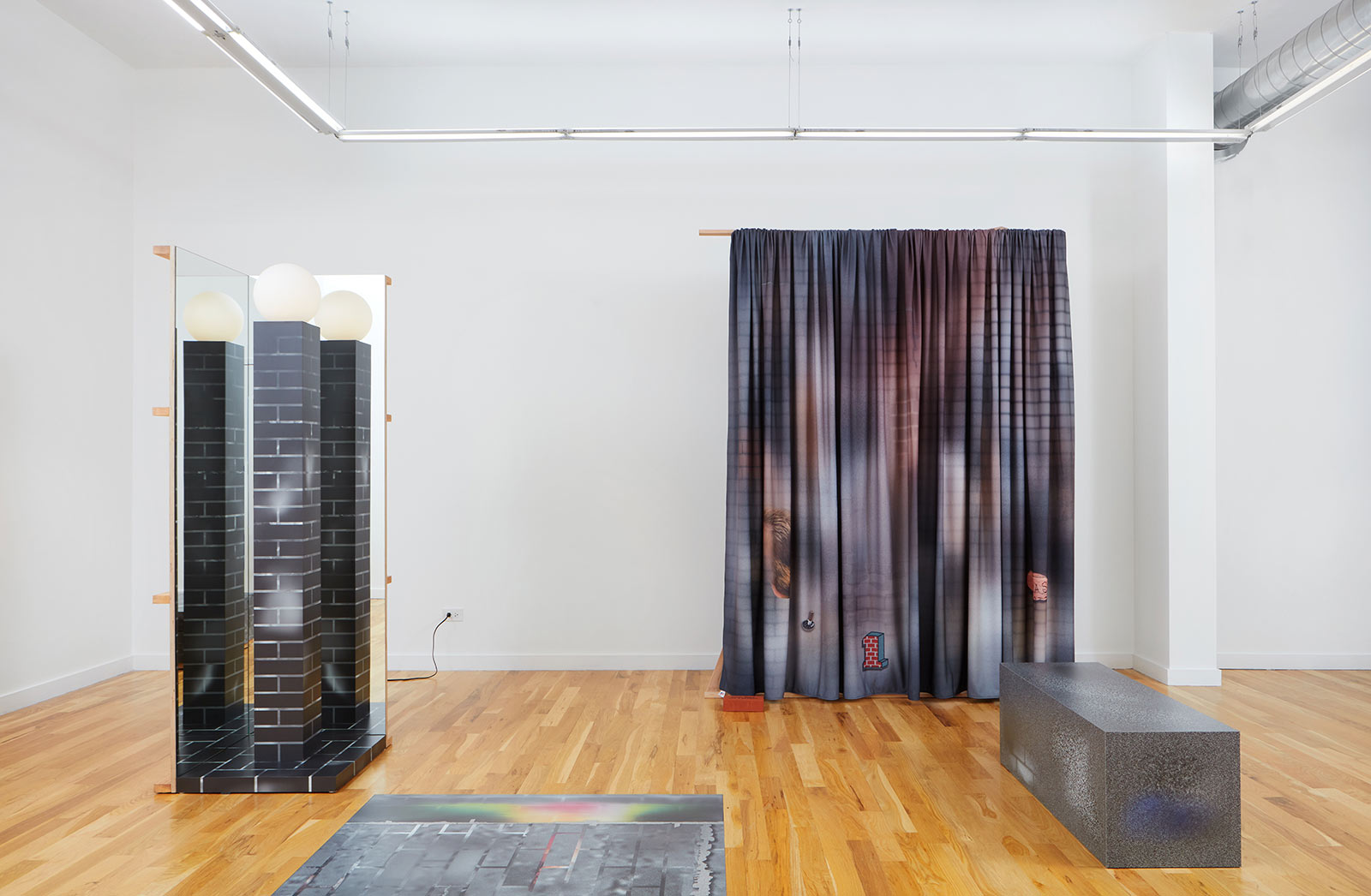
Installation view
COURTESY: Volume Gallery
POLISH-BORN ARCHITECT Ania Jaworska has made a name for herself by developing research-based projects, objects, interiors and freestanding structures that seek to inspire conversation on topics as wide-ranging as human behaviour and cultural appropriation. Her ongoing enquiries range across architecture, art and design, with one field often serving as the content and the other as the form. As is evident in projects like SET (2016), Tenure (2020), or even her outfit of the Graham Foundation bookshop (2013), intellectual devices like humour, historical references and trompe l’oeil are central to Jaworska’s practice. She anchors her concepts in clear, decipherable forms that distil and communicate her underlying messages.
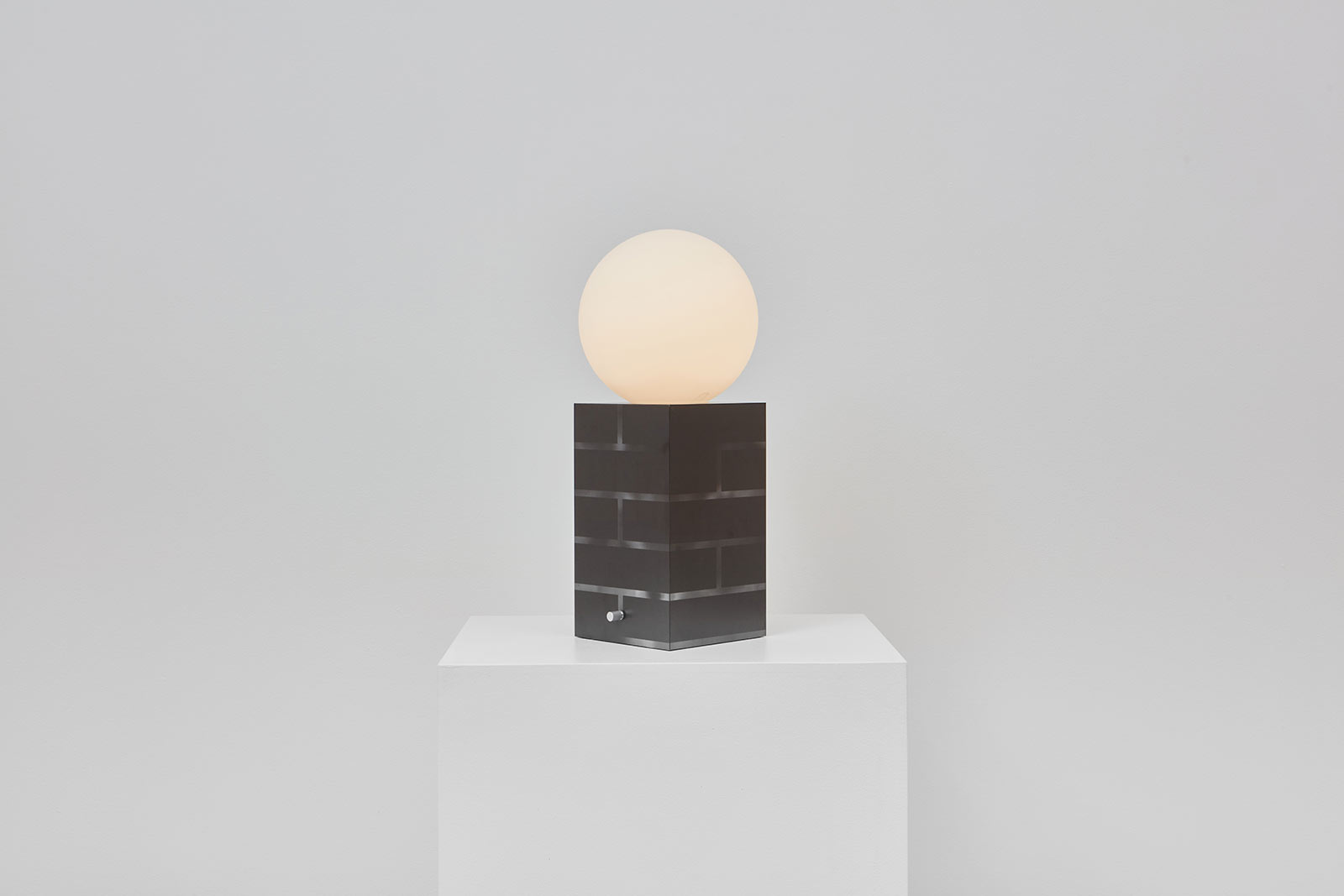
Ania Jaworska, ‘Table Lamp (Dark)’, 2021
COURTESY: Volume Gallery
Jaworska trained at the Cracow University of Technology and Cranbrook Academy and is now based in Chicago where she brings this interdisciplinary approach to her teaching at the University of Illinois at Chicago, School of Architecture and The Art Institute of Chicago. Jaworska’s latest undertaking – a collection of furnishings, textiles and luminaires – plays homage to the city’s rich architectural heritage. Presented in a solo show at Volume Gallery, ‘BRICKS’, her recent work stems from an in-depth exploration of an overlooked, humble – yet essential – building material that is too often taken for granted. The Design Edit contributor Adrian Madlener spoke to the architect about the ins and outs of this dynamic project.
The Design Edit (TDE): How did the project first come about?
Ania Jaworska (AJ): Bricks are omnipresent in Chicago – this city where I’ve lived and worked for most of my career – and so it’s something that I’ve subconsciously responded to for a long time. However, bricks are generally a material that we tend to cover up. For instance, when they are left exposed in order to wrap the facade of a building, it is the better quality bricks that are used. Whereas cheaper elements are used for the actual construction. I was also fascinated by how this iconography translates into construction company logos. This archetypal representation is used to suggest something old that is sturdy, durable and reliable – especially when it’s employed as a graphic veneer in new residential developments. The juxtaposition of surface value and the quality of solid modular material that is so much a part of our surroundings was something I wanted to emulate in this collection.
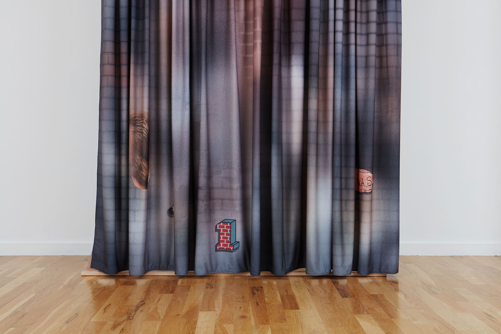
Ania Jaworska, ‘Curtain’, 2021
COURTESY: Volume Gallery
TDE: How is this investigation reflective of your practice?
AJ: In my work, I’m generally interested in how our built environment affects us on a cultural and even behavioural level; how we act in controlled spaces. I’m always looking for opportunities to reflect on this topic. With the ‘Subjective Catalog of Columns’ project I developed with the Museum of Contemporary Art Chicago in 2015, I sought to isolate different examples of this ubiquitous architectural element, as uncovered throughout the city, in distilled graphics. I connected each image to particular narratives as they related to specific locations.
Part of my curiosity with creating this typology was to see how different cultural institutions have used these structural components as decorative elements in their building to reflect a sense of power, perpetuity and prestige. Does an Ionic flourish denote something different from a Doric or Corinthian substitute? Like bricks, columns are also used in company logos in ways that seem so bizarre when considered on closer inspection, however we usually accept them on a subliminal level. Architectural materials and paradigmatic forms don’t just exist within that realm, but also belong to culture and our everyday lives.
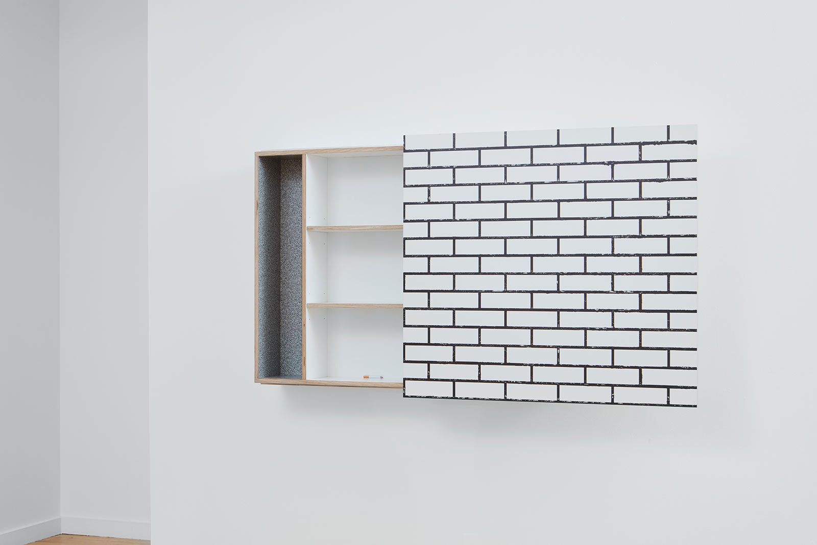
Ania Jaworska, ‘Wall Cabinet’, 2021
COURTESY: Volume Gallery
TDE: How does this correlate with the new BRICKS project?
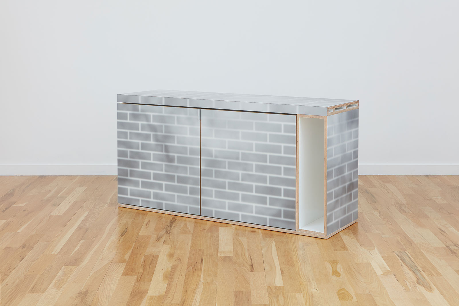
AJ: The project culminates as a graphic exploration but takes the form of furniture and accessories. It was vital for me to get the first part right, so I collaborated with artist Beverly Fre$h to create almost freeze-frame-like collage images of brick surfaces and superimposed those visuals on laminates. The textures we choose are subtle; some are gritty with layers of seemingly blurred out graffiti, while others take on an almost patinated and iridescent quality. The very real conditions of c-cracking and mortar oozing are also exaggerated in these compositions. There’s a lot of contrast in terms of perceived declinations. There’s a hidden quality that alludes to the heavy industry of Chicago’s past.
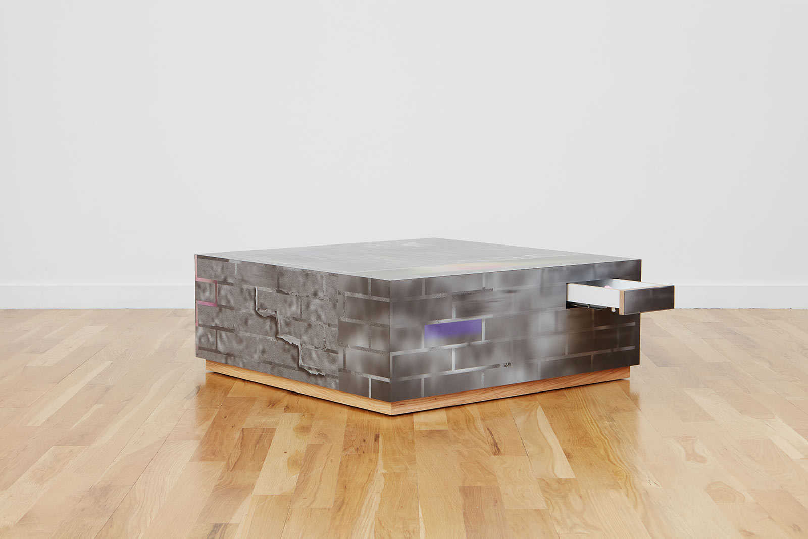
Ania Jaworska, ‘Coffee Table’, 2021
COURTESY: Volume Gallery
Matt Junn helped me formulate the shapes and proportions of the ‘Credenza’, ‘Wall Cabinet’, ‘Table Lights’, ‘Coffee Table’, ‘Bench’ and ‘Curtain’, which was produced using printed fabric. We decided to work with archetypal and straightforward shapes that would lend well to incorporating brick proportions and cubic structures. There’s a common formal bond. It is crucial for the conceptual framework of this collection that all of the works remain functional.
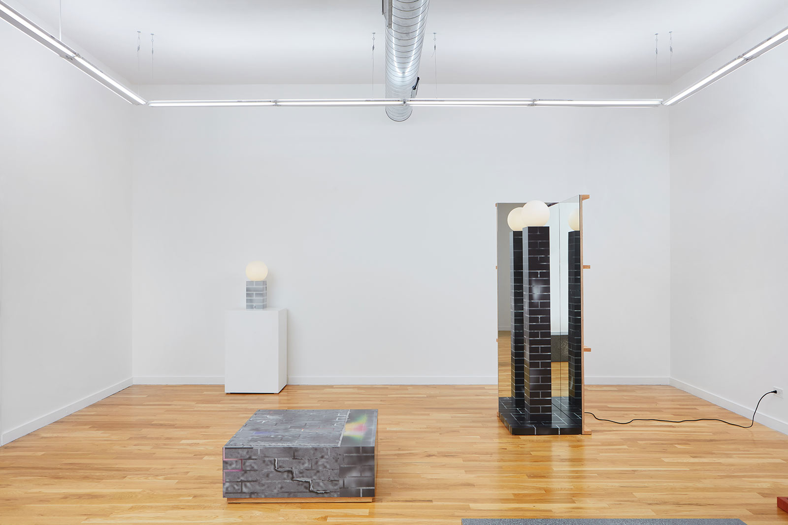
Installation view
COURTESY: Volume Gallery
TDE: Talk us through some of the pieces in the new collection.
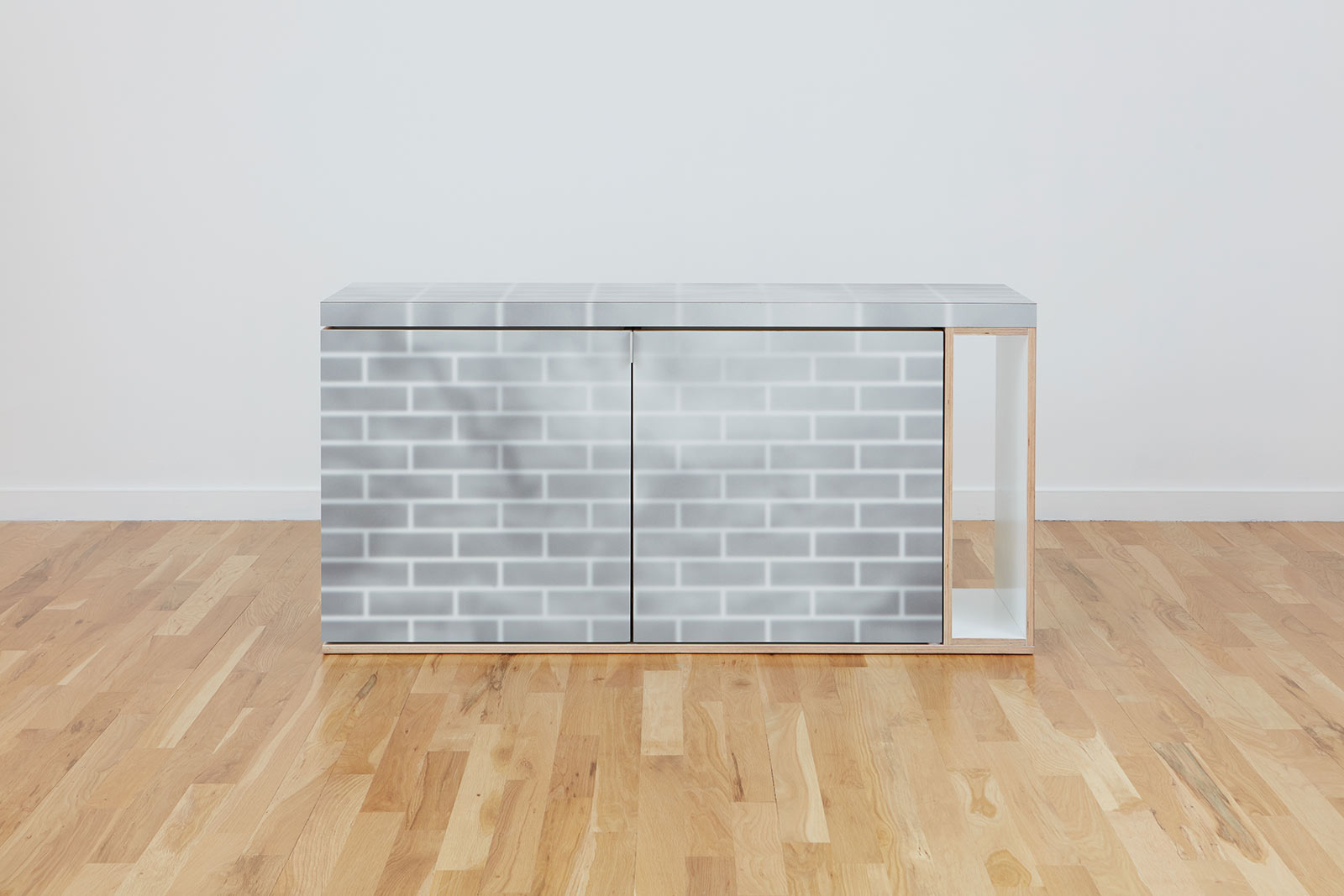
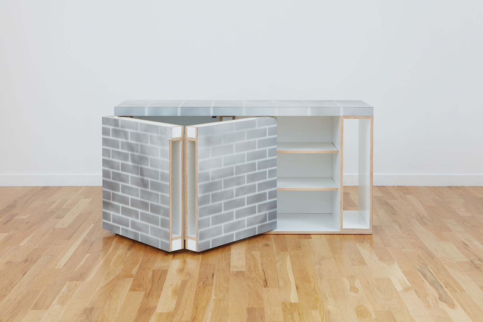
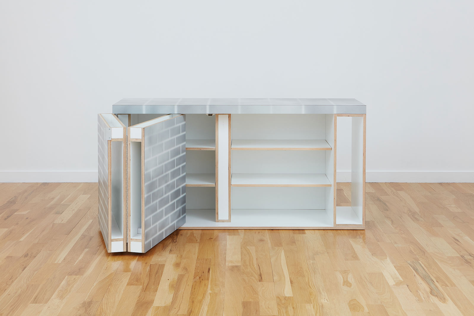
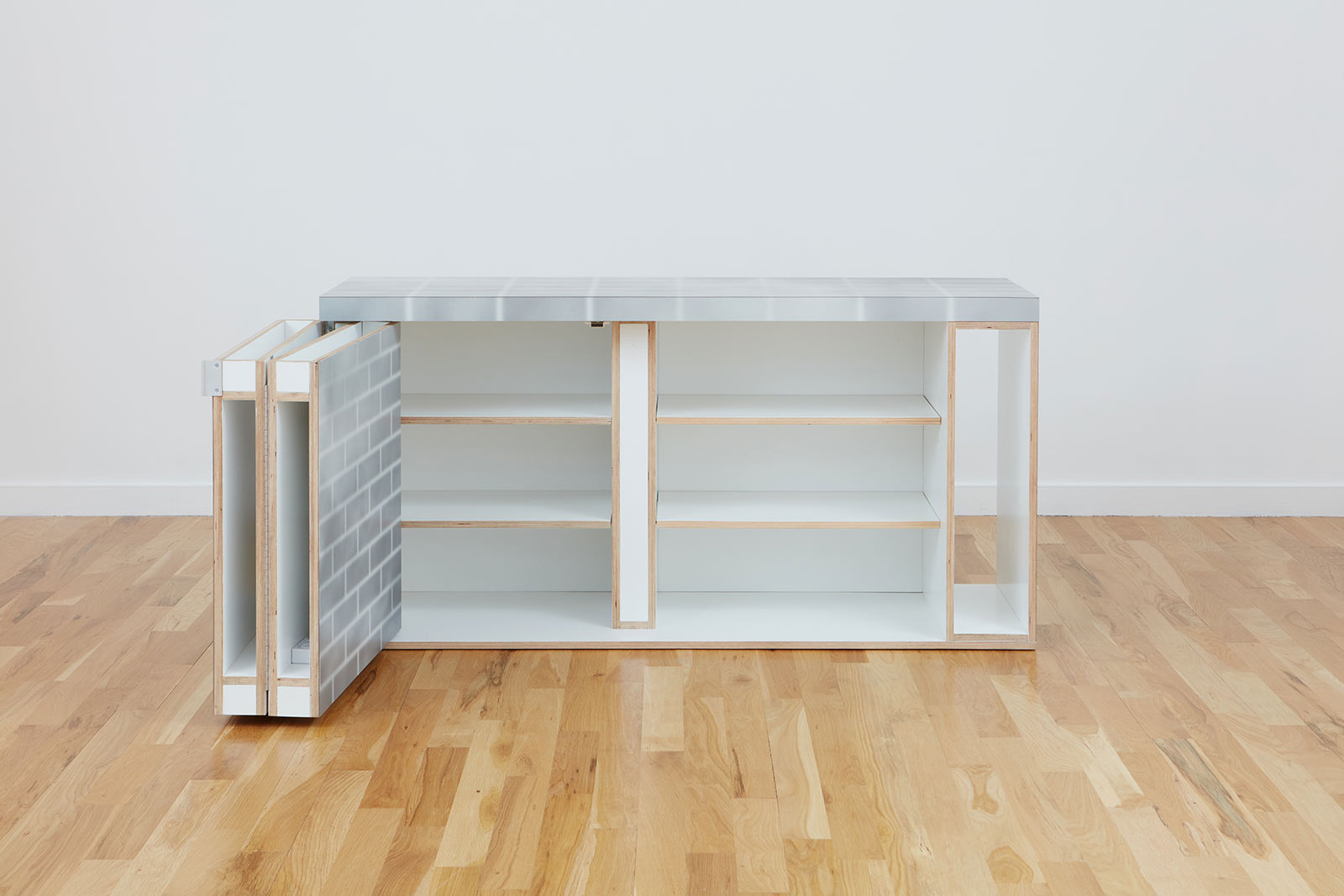
AJ: For a lot of the pieces, we thought carefully about how we could measure the depth based on the standard proportions of brick. This approach tied in closely with the complexity of brick veneer and facades versus the constructive capacity of this material. The ‘Credenza’, in particular, does an excellent job of demonstrating this formalised concept. The laminated surface is applied to an open structure wooden framed door that directly suggests that the bricks are not actually there. It also indicates that there’s something behind what ostensibly looks like an impenetrable wall. This element plays on the idea of what can be a solid plane and an encapsulated void. Most of the pieces can only be understood through interaction. They impose a kind of behaviour on the user and make them reconsider things that might otherwise seem a given. As an added element, a truck backing-up noise sounds off when the doors unfold.
-
Ania Jaworska, ‘Credenza’, 2021
COURTESY: Volume Gallery
-
Ania Jaworska, ‘Credenza’, 2021
COURTESY: Volume Gallery
-
Ania Jaworska, ‘Credenza’, 2021
COURTESY: Volume Gallery
-
Ania Jaworska, ‘Credenza’, 2021
COURTESY: Volume Gallery
-
Ania Jaworska, ‘Credenza’, 2021
COURTESY: Volume Gallery
Another key piece is the tall ‘Corner Light’, which perhaps has the most architectonic presence out of all of the works. Positioned towards the back of the gallery, this fragmented plywood wall structure is significant because it makes the most of the brick veneer but does not purport to be anything else. It almost exactly reflects what a street light might look like. The surface is reflective, which adds an extra element of interactivity. This work is all about bringing bricks back into our interiors and not just a construction material hidden behind pristine plaster walls. Brick background walls are so quintessential to Chicago and especially its famous stand-up comedy scene. My goal for the entire collection is to challenge the convention of how these modular blocks are so implicit in our daily lives.
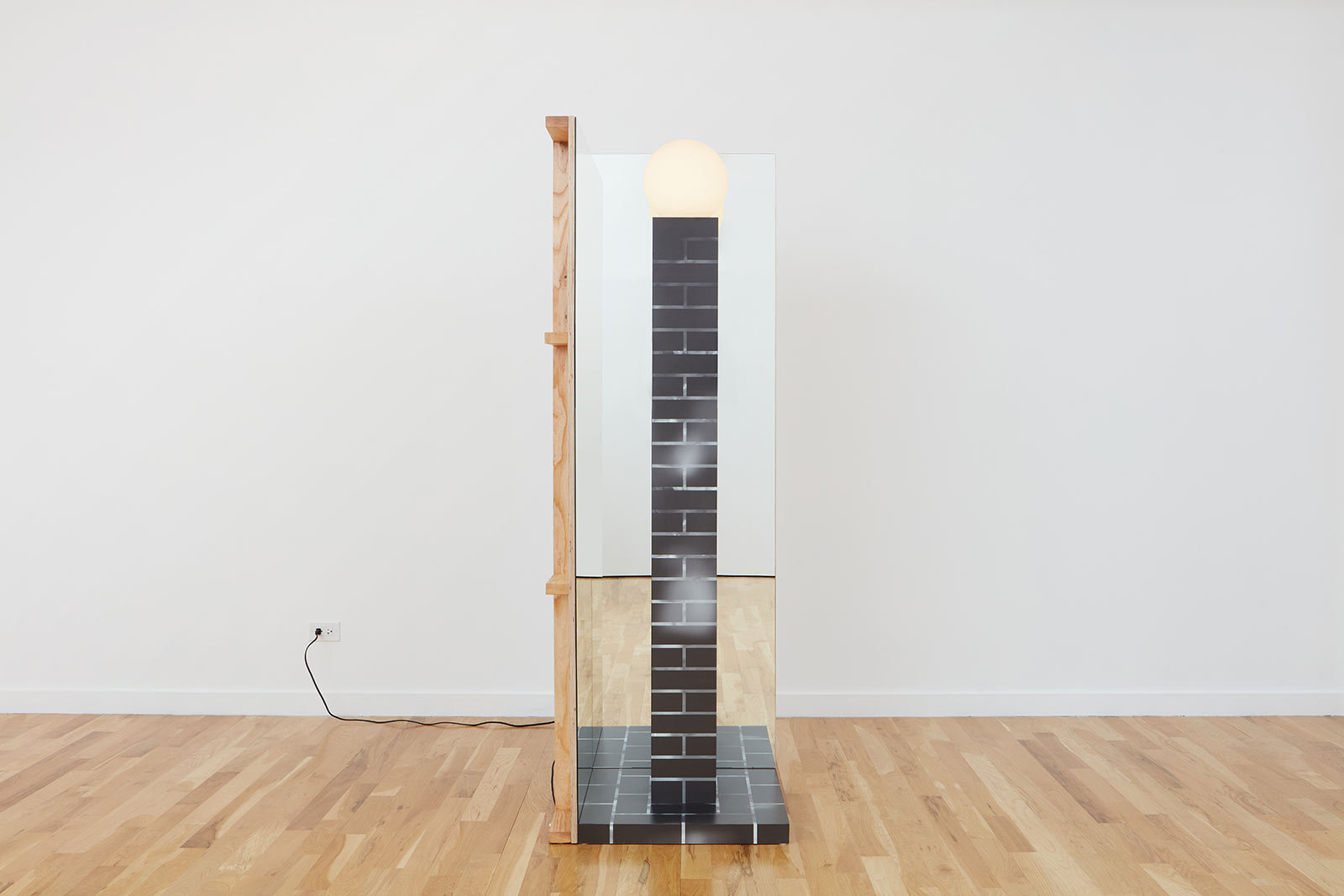
Ania Jaworska, ‘Corner Light’, 2021
COURTESY: Volume Gallery
Ania Jaworska: BRICKS is showing at Volume Gallery.

