Collective Design x Frieze New York
A selling exhibition of art and design demonstrates how colour itself can be a material, essential to a work and not just a finishing flourish.
Color and Production: From the Atom to the Void
8th – 15th May 2020
By Emma Crichton-Miller / 30th April 2020
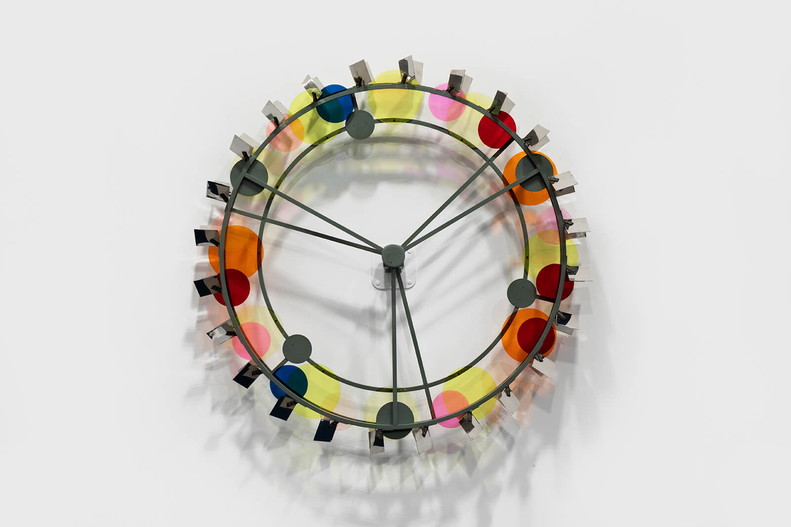
Bruno Munari, ‘Fontana a Ruota’, 1958
COURTESY: Andrew Kreps Gallery
THIS WEEK SEES the welcome return of New York’s Collective Design Fair, albeit, in this pandemic year, online. After skipping last year, Collective’s Founder and Creative Director, Steven Learner agreed a collaboration with Frieze New York 2020. The Design Fair would curate a special selling exhibition as an adjunct to the contemporary art fair. Color and Production: From the Atom to the Void, curated by the esteemed design historian and curator, Libby Sellers, traces the way developments in the production of colour – from the intense pigments used in illuminated manuscripts, to the most advanced electronic and digital technologies – have inspired artists and designers alike. This eclectic spread of art works and designed objects, from the sixteenth century to newly produced pieces from Sabine Marcelis, Jochen Holz and James Welling, will now unfold in virtual space, within the Frieze Viewing Room, opening 8th until 15th May, with a preview 6th-7th May.
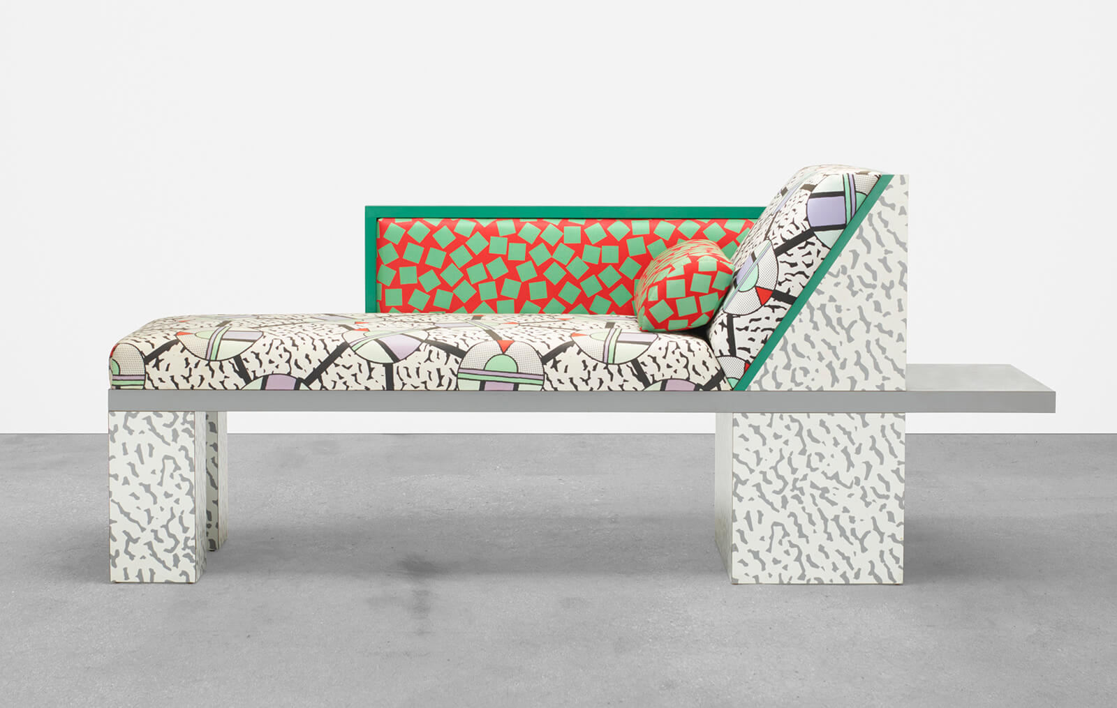
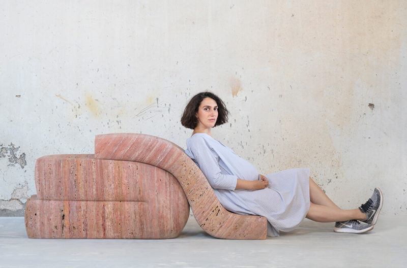
Nathalie Du Pasquier, ‘Royal Chaise/Dormeuse’, design 1983, production 2015
COURTESY: Urban Architecture Inc.
Last May, New York was chock-a-block with design. TEFAF New York fielded a cohort of the world’s leading design galleries while Object & Thing, held in a repurposed warehouse, offered 200 different objects from a wide range of galleries, made by artists and designers. This year, in response to the world health crisis, TEFAF New York and Object & Thing have opted to reschedule to late fall. Frieze took the decision to cancel the physical fair altogether, but to bring forward new online initiatives already in development. They recognise that these are likely to be an increasingly important draw for contemporary art galleries in the future, keen to attract buyers from all four corners of the globe.
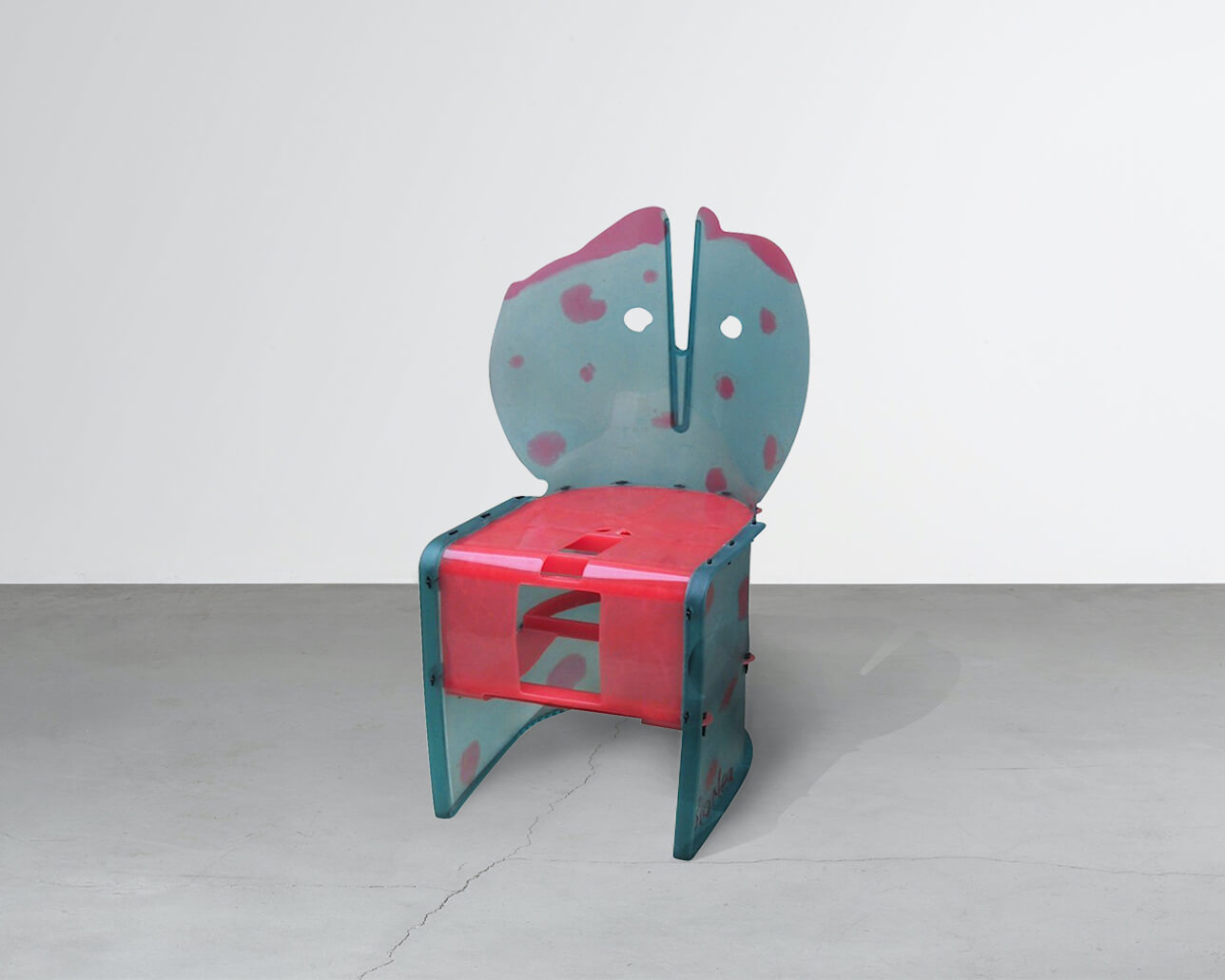
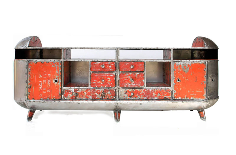
Gaetano Pesce, ‘Nobody’s Armchair’, 2002
COURTESY: Nilufar
Learner is not too dismayed by the jump online: “This digital platform strangely offers benefits as we certainly will reach a more diverse and broader global audience than we would have physically. In addition we are presenting a version of the original experience of the exhibition which viewers can follow in a more linear fashion, room by room, seeing key pairings and themes as Libby envisioned them.” He adds, “There are just exquisite objects that will be seen differently in the context of an art and design exhibition.” The works are drawn from international galleries as diverse as Friedman Benda, Galerie kreo, Giustini Stagetti, Hostler Burrows, David Zwirner, Sean Kelly Gallery, Massimo De Carlo, Gabrielle Ammann and Urban Architecture, with pieces by leading twentieth century artists such as Donald Judd, Sheila Hicks or Josef Albers in conversation with works by Ettore Sottsass, Gaetano Pesce and Formafantasma.
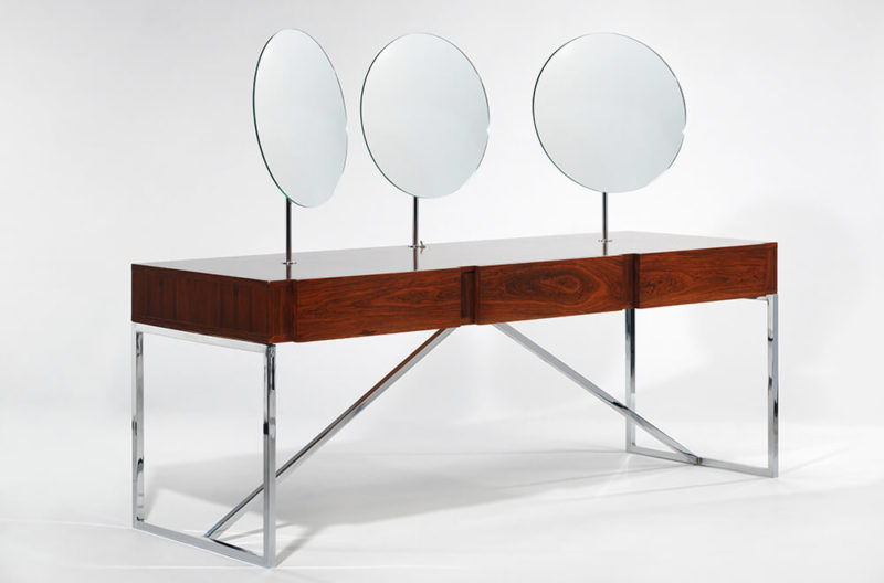
John Shea, ‘Foresight’, 2019
COURTESY: Hostler Burrows
In response to the physical fair’s cancellation, Sellers has organised the works into categories that will be presented in three ‘rooms’. The first room, ‘Mapping’, features works which have been inspired by colour theory and the study of colour as a scientific phenomenon. The second room, ‘Matter’, traces the evolution of pigment but will also include works featuring inert gasses, polymer coated substrates (3D Printing) and inorganic materials that were never pigment. In the final room, ‘Material’, Sellers examines the role that production and manufacturing have played in the evolution of colour. Sellers explains her approach, “In design, and particularly twentieth century industrial design, colour was historically treated as the last flourish, the final embellishment – not something that was intrinsic to the object’s beginnings.” Her show by contrast, gives “agency back to colour by treating it as a prime material in its own right.”
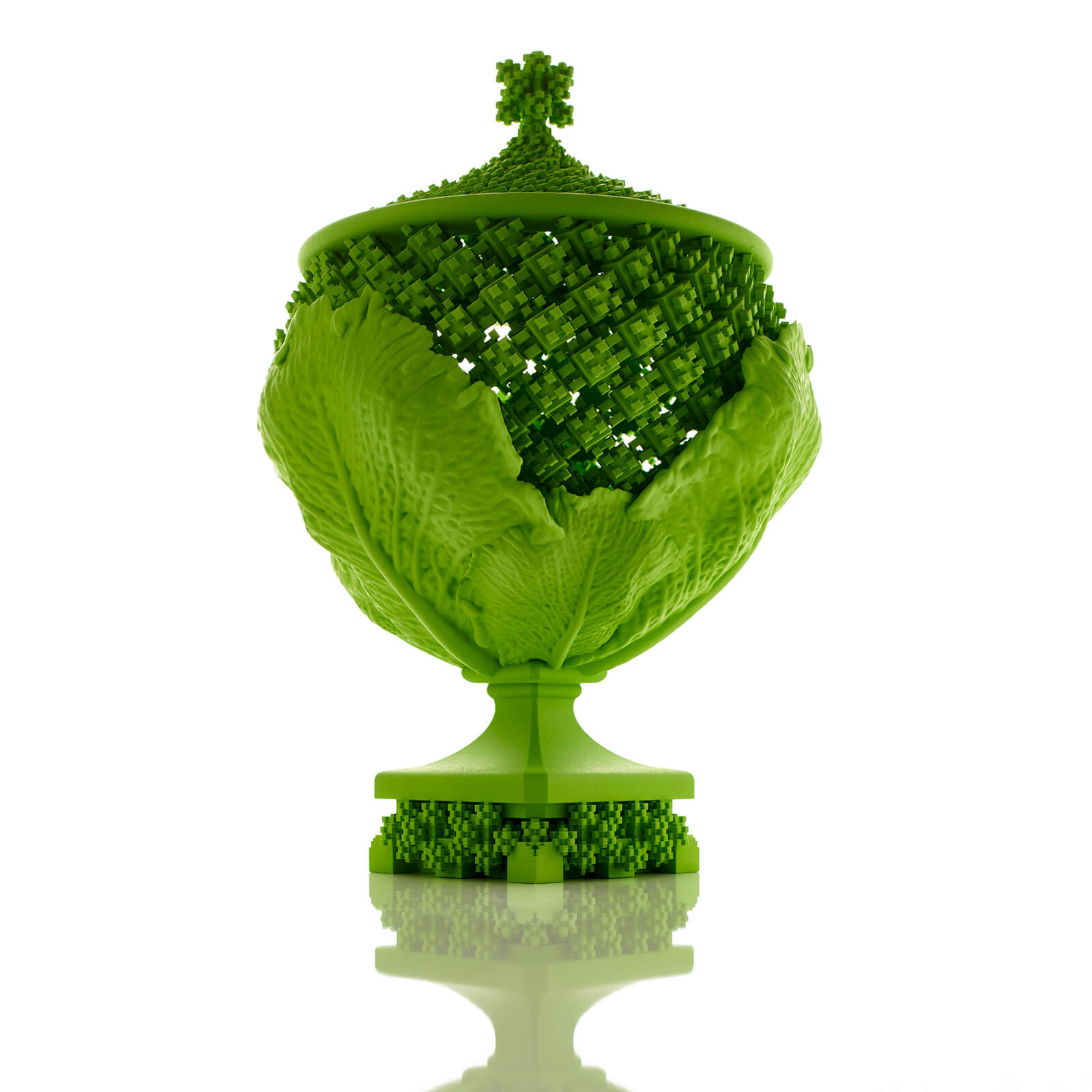
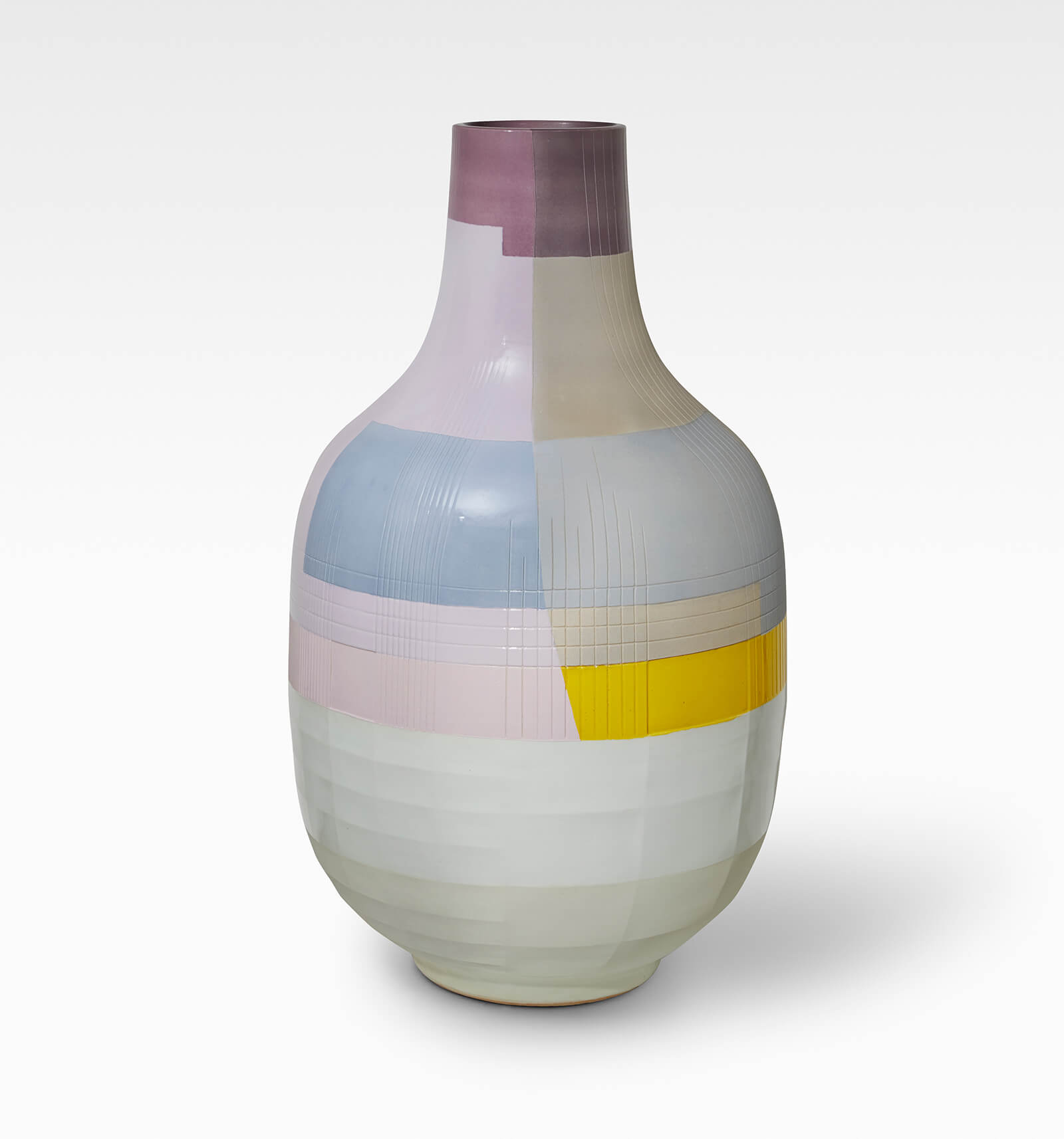
Michael Eden, ‘Romanesco Vase I’, 2017
COURTESY: Adrian Sassoon
Sellers emphasises that “the choice of material is never completely objective”. She has included in the exhibition artists who have employed particular materials for political or ideological reasons, “For example, when Conceptual, Minimal or Radical artists and designers, from the 1960s on, embraced ready-made, found or newly commercialised industrial materials by ways of stripping any luxury from their work.” She has also chosen examples from Formafantasma and Tanya Aguiniga, to show the ways in which many contemporary practitioners “are returning to pre-industrial or natural colourants, by way of commenting on an over reliance on petroleum-based materials, or the dubious origins of certain mined and harvested materials.”

Formafantasma, ‘Colore – Test 3’, 2016
COURTESY: Giustini / Stagetti
The choices may also be more personal. Sellers cites the British conceptual artist Alan Charlton (born 1948), who works only in grey, using industrially produced stable colours which behave the same in all locations, and under all light. The Dutch designer Hella Jongerius, meanwhile, has, says Sellers, “spent the last few decades fighting against exactly this standardisation within industry. She believes this has reduced colour to static, objective systems.” Jongerius mourns the loss of richness achieved by more costly, artisanal methods.
Hella Jongerius, ‘Facet Bottle – Day #3’, 2019
COURTESY: Galerie Kreo
The show includes some eye-popping examples of twentieth and twenty-first century design, as well as more muted explorations of the impact of colour on form and function. Asked what might be her own favourite colour, Sellers replies: “Instead of a favourite colour, I’d say I like light. As without light – there can be no colour.”
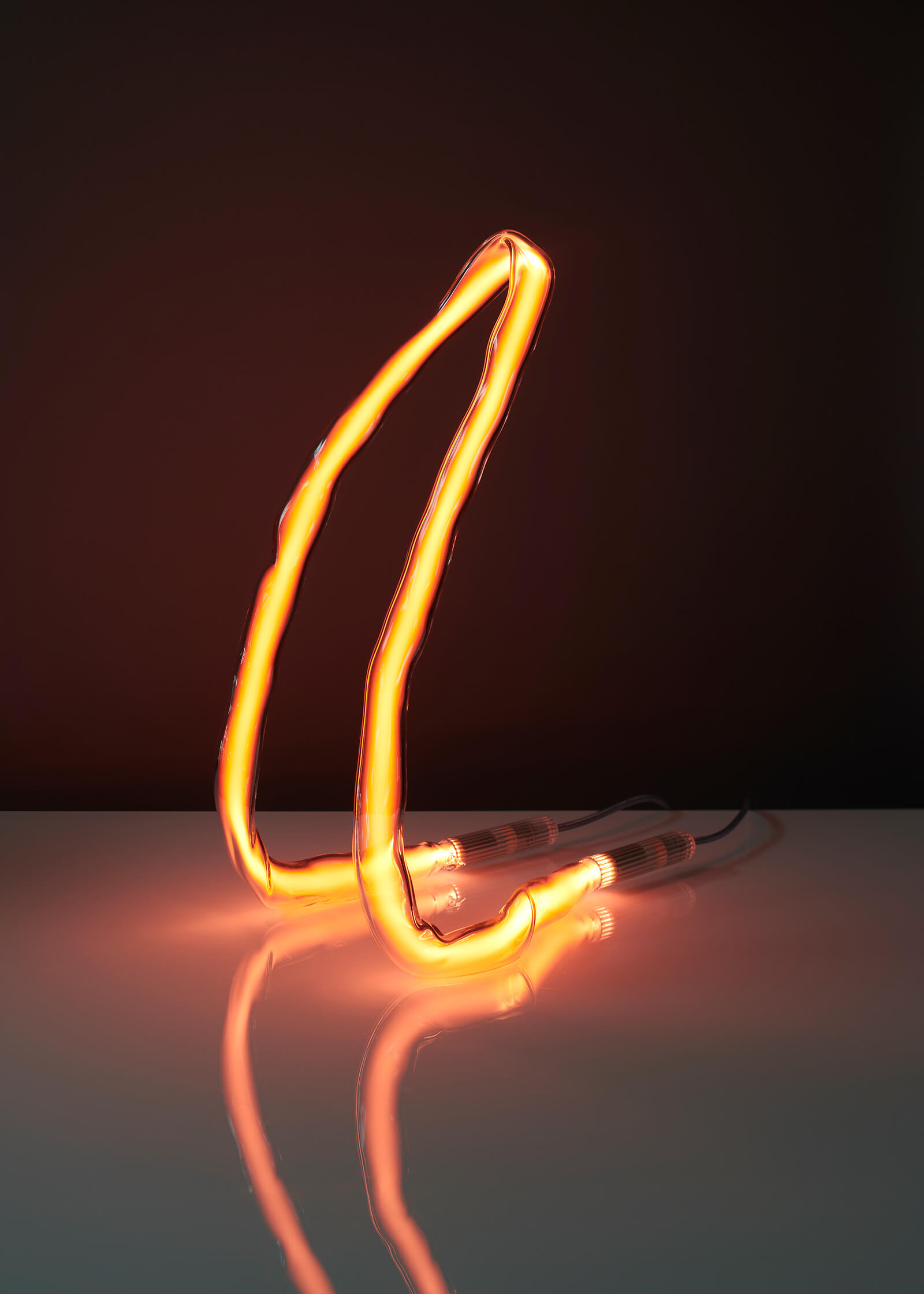
Jochen Holz, ‘Untitled’, 2020
COURTESY: The Future Perfect
Color and Production: From the Atom to the Void – bridging the worlds of design and art, the exhibition will feature significant historical objects alongside works by contemporary designers and artists.

Emma Crichton-Miller is Editor-in-Chief of The Design Edit.
View all articles by Emma Crichton-Miller