MoMA reopening
Art-historical categories are muted in favour of an interdisciplinary approach: the jury is still out whether design is served well by MoMA’s latest expansion.
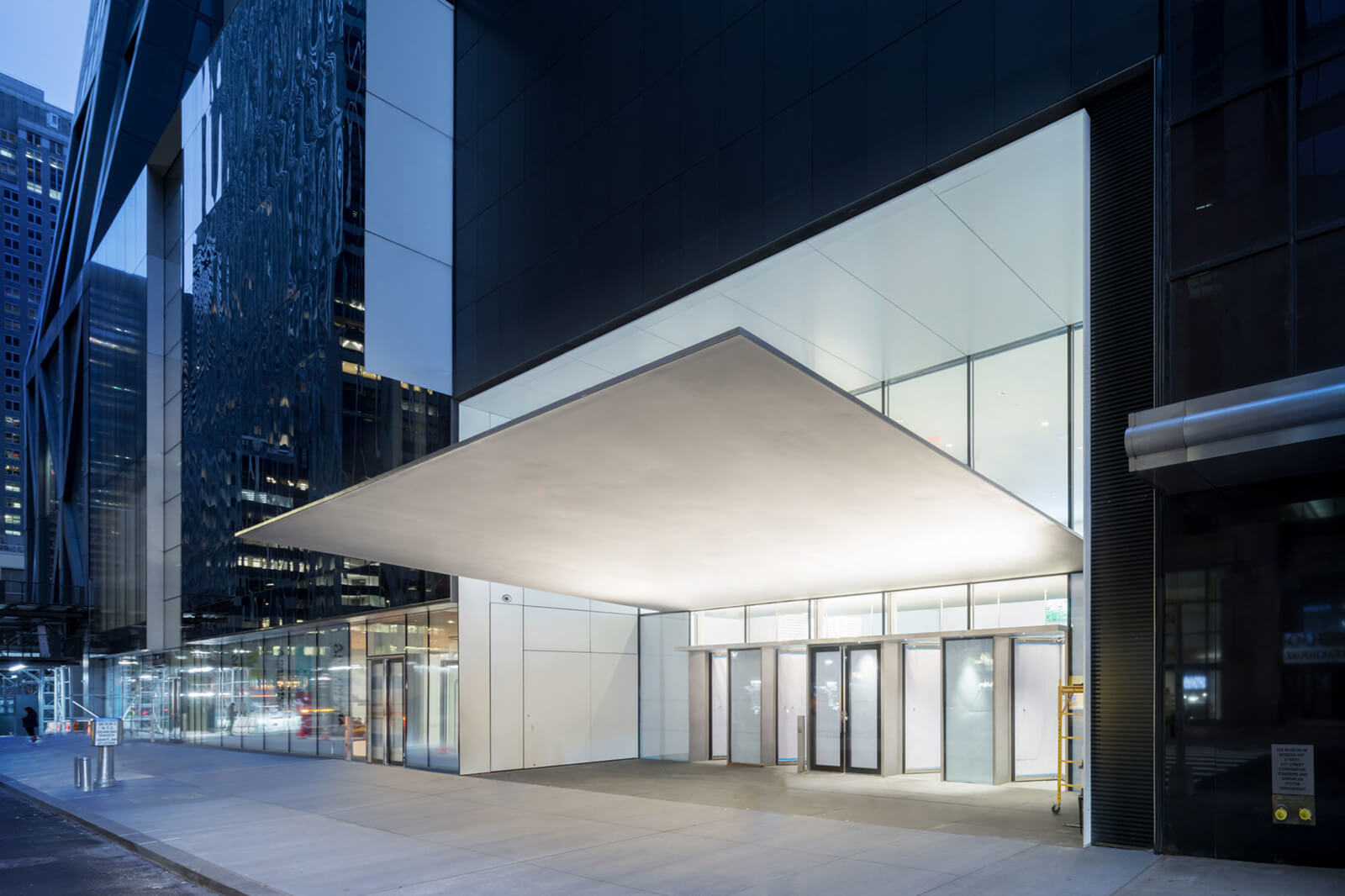
Exterior view of The Museum of Modern Art, 53rd Street Entrance canopy
COURTESY: MoMA / PHOTOGRAPH: Iwan Baan
NEW YORK’S MUSEUM of Modern Art is celebrating its 90th year in a big way, not only by a major expansion and redesign of its quarters, but by radically revising its approach to the history of modern art. The museum’s latest expansion, opened to the public on 21st October, completes what amounts to the takeover of almost an entire city block. The six-storey, glass-fronted building absorbs the former site of the demolished American Folk Art Museum, and cuts through three floors of an adjacent Jean Nouvel apartment tower to create 47,000 square feet of new and renovated gallery space, a more open and welcoming entrance, increased public space, and a radically new way of presenting its collections.
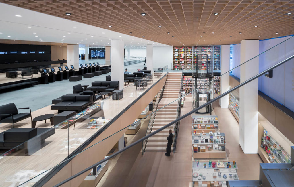
Interior view of The Museum of Modern Art, Flagship Museum Store
COURTESY: MoMA / PHOTOGRAPH: Iwan Baan
Instead of the familiar narrative of art history followed by MoMA since its opening – treating modern art as a succession of avant-garde movements from Cubism to Abstract Expressionism, and adding architecture, furniture and decorative arts (and later film and video) as separate disciplines – the museum is not only being more inclusive of ethnic minorities and women, but is treating all disciplines as interrelated. Design lovers may, however, find the changes disappointing. A MoMA press release heralds a “dynamic presentation of architecture and design across all floors of the museum,” but while it is true that architecture and design are present on all floors, the integrated presentations sometimes seem to marginalise design objects.
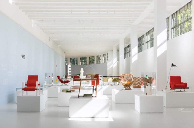
The three floors of galleries devoted to the permanent collections have been organised roughly in chronological sequence, in a series of some 60 themed galleries, with each section arranged collaboratively by chief curators of five different departments, and each gallery given a general theme. With disciplinary divisions erased, painting, sculpture, design, architecture, photography and film are shown in the same spaces, though obviously not all are equally prominent in every location, and each discipline has been given some independent space apart from the themed galleries.
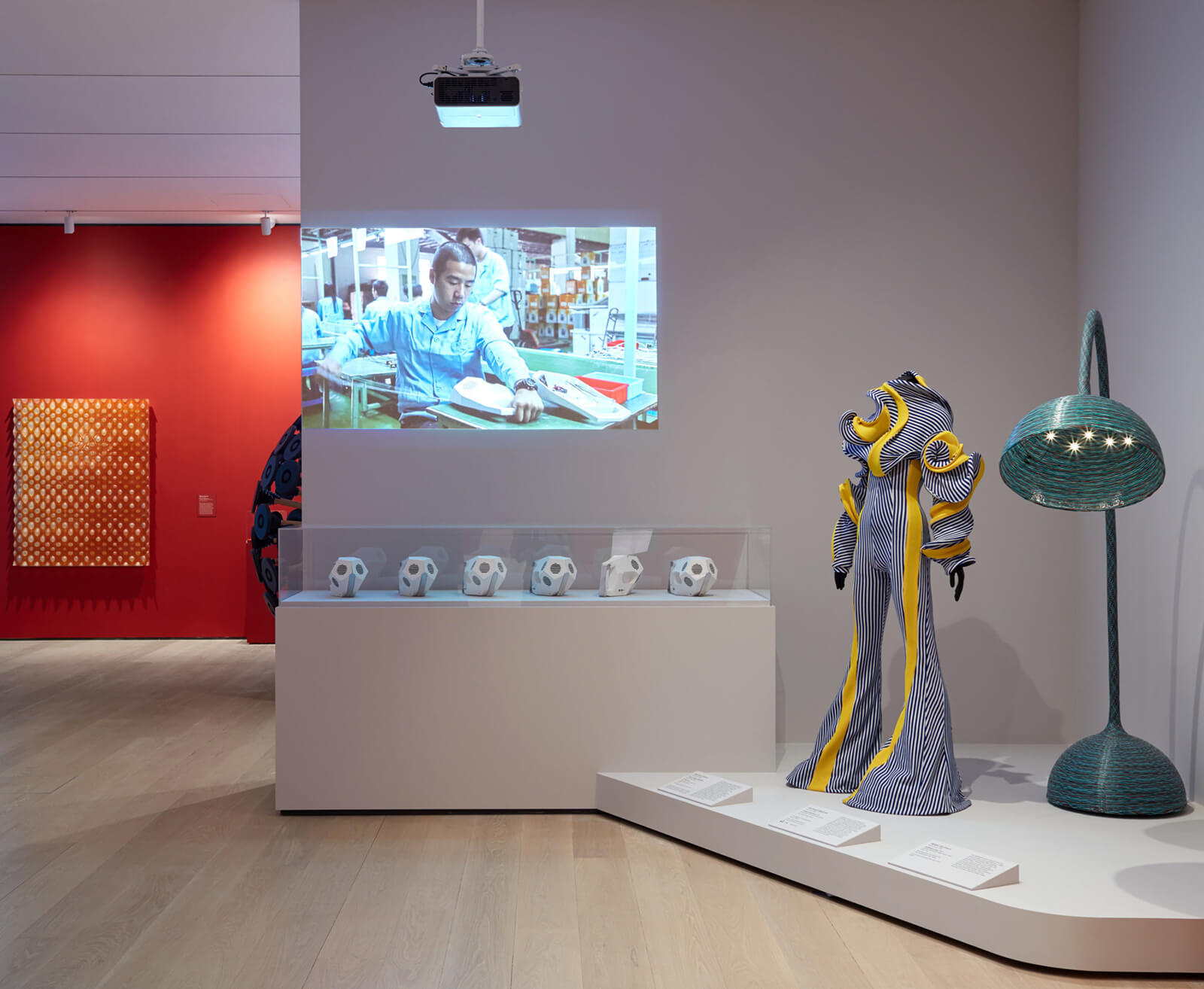
Installation view ‘Energy exhibition’. (From left to right) Revital Cohen and Turr Van Balen, ‘75 Watt’, 2013; Richard Malone, ‘Jumpsuit Specimen’, 2017; Wieki Somers, ‘Bellflower Lamp’, 2007
According to Paola Antonelli, Senior Curator, Architecture and Design, “The new concept for the MoMA collection galleries, relying on an inter-departmental and interdisciplinary narration of the evolution of the modern, allows us to flaunt some of our most spectacular architecture and design pieces in full context and in new settings.” Curator Juliet Kinchin adds that “It’s important for us to break out of that broad chronological flow,” noting the “visual echoes and connections” she found between objects, and the collegial experience of working with painting and sculpture curator Ann Temkin to make selections for the galleries.
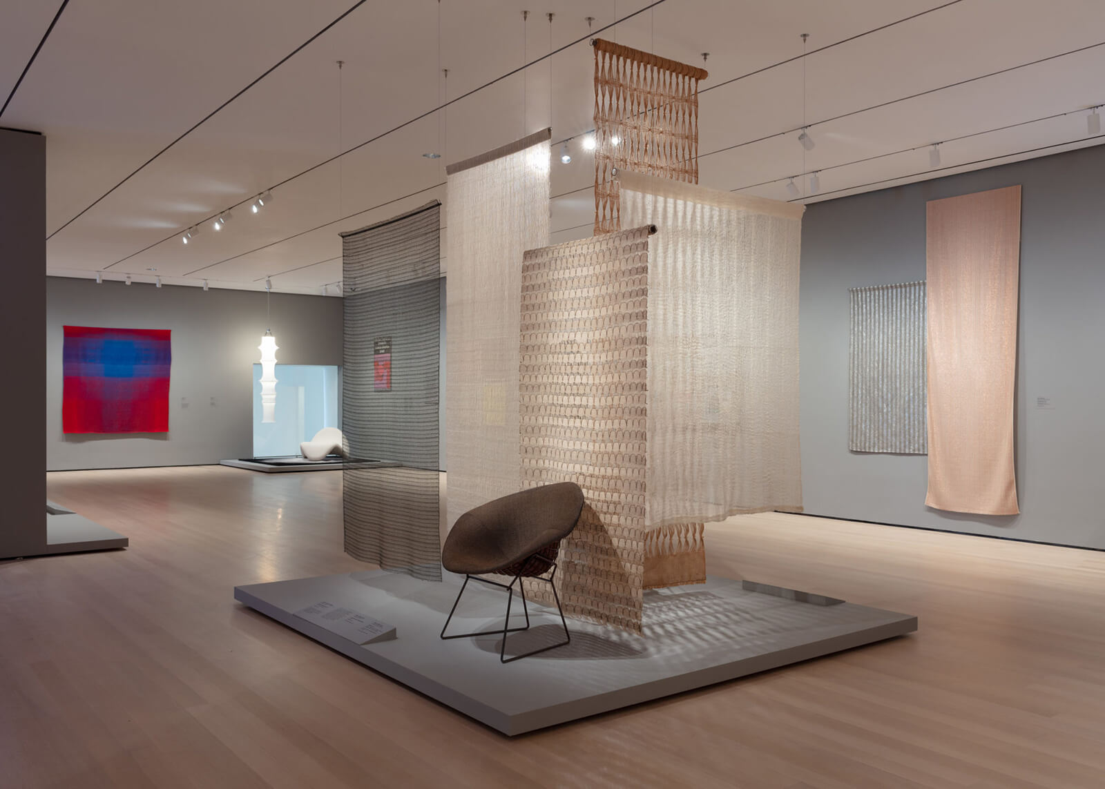
Installation view ‘Taking a Thread for a Walk’
COURTESY: MoMA
It is true that the interdisciplinary approach provides some eye-opening insights: that potter George Ohr was contemporaneous with Brancusi and Van Gogh, or that Eileen Gray designed her iconic panel screen in the same year as Picasso’s ‘Three Musicians’, or that a Jacques Tati film clip would be the perfect complement to Mies van der Rohe architectural drawings. And a pierced-steel Scott Burton chair is a brilliant companion to a bold black-and-white Keith Haring painting. But for the most part, design, perhaps hamstrung by its connection to functionality, comes up a bit short, while film and video, when shown alongside paintings, are implicitly enhanced in stature. Since a third of the galleries will be reinstalled every six months, the balance may change from time to time, but is hard to see how objects hung on walls at eye level will not inevitably seem more prominent than those placed on the floor, or even on platforms.
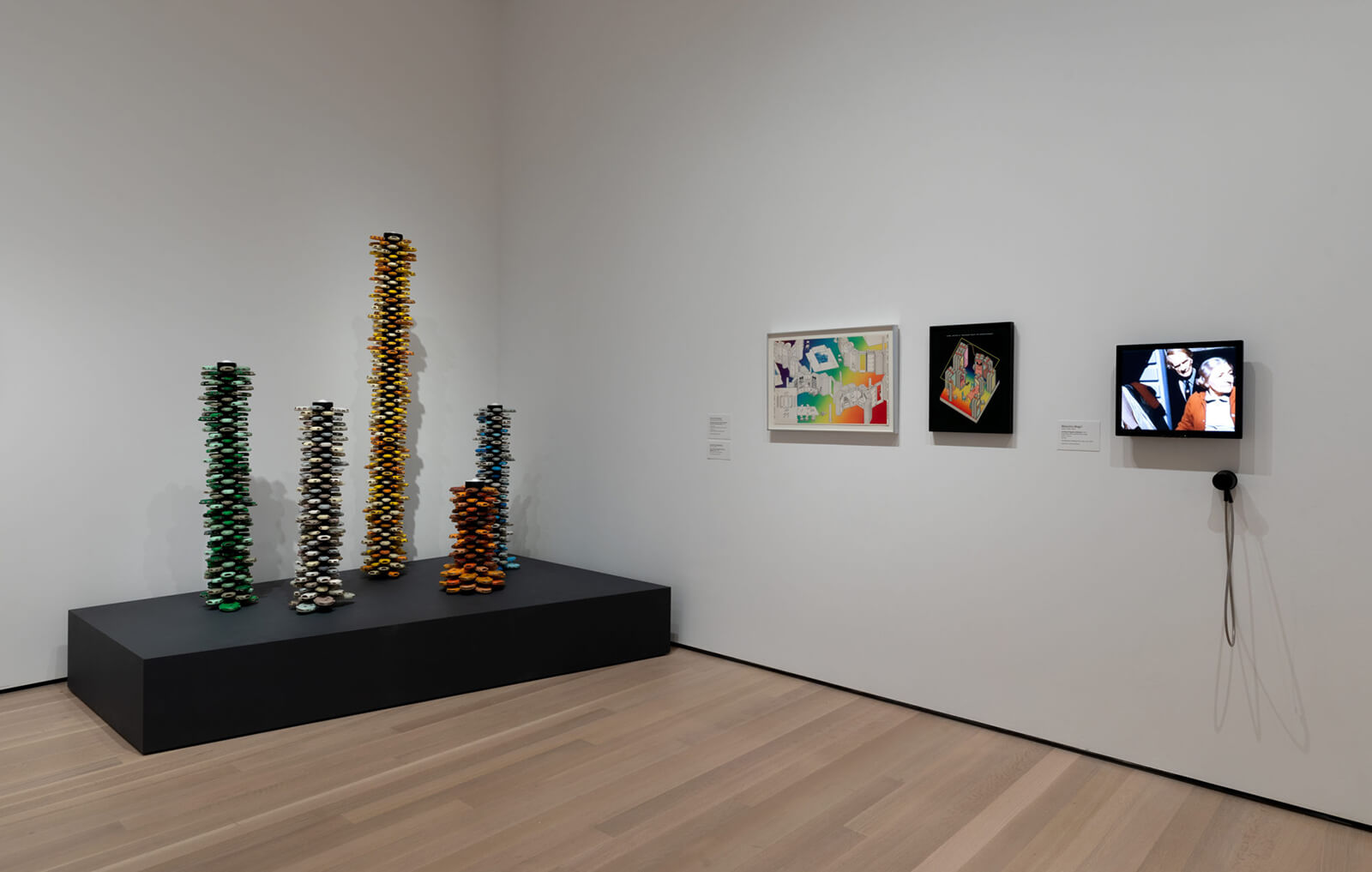
Fourth Floor, 1940 -1970 ‘Architecture Systems’. Daniel Grataloup, ‘Urban Proposal with Multi Thin-Shell Capsules’, project
COURTESY: MoMA
There is, sadly, no longer a dedicated Architecture and Design gallery where design lovers can go to visit their favourite classics, or to look for new and interesting acquisitions. However, several of the themed galleries focus on architecture and design (the two are part of a single curatorial department), and these benefit from the multidisciplinary approach: “The Vertical City,” for instance, includes photography, film, and a movie poster along with architectural drawings and scale models. ‘Architecture for Modern Art’ shows Frederick Kiesler furniture as well as drawings and models of the MoMA and Guggenheim museums, and ‘Design for Modern Life’ stars “Grete” Schütte-Lihotzky’s ‘Frankfurt Kitchen’ and includes contemporaneous and artistically congenial works by Bauhaus designers, French modernists, Der Stijl and the Russian Constructivists.

Installation view, Second Floor, 1970 – present, ‘Building Citizens’
COURTESY: MoMA
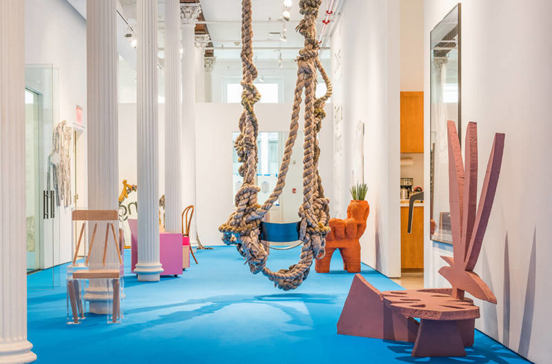
There are also two special exhibitions worth noting: ‘Taking a Thread for a Walk’ focuses on textiles and features a spectacular wall-sculpture by Magdalena Abakanowicz and a ceiling-high cluster of multicolour ropes by Sheila Hicks. It traces the history of textiles as an art medium, showing Anni Albers and other textile artists along with Hans Wegner and Pierre Paulin furniture, and noting the role of manufacturers Knoll and Herman Miller in textile development.

Installation view ‘Taking a Thread for a Walk’. (From left to right) Anni Albers, ‘Structo ArtCraft 750 loom’, circa 1952; Ed Rossbach, ‘Raffia Lace Basket’, 1973; Unknown designer, ‘(Coptic) Christ enthroned’ 6th-8th century C.E.; Aurèlia Muñoz and Antoni Gaudí, ‘Study of a catenary arch for the Gaudí crypt at Colonia Güell’, 1996
COURTESY: MoMA
‘Energy’, the other special exhibition, is in one of two street-level, free-admission galleries inaugurated with the expansion. The exhibition gives circuit boards and video game software equal billing with a General Electric engine fan blade, a futuristic jumpsuit, and lighting designs including Ingo Maurer’s ‘Porca Miseria’ chandelier of exploding dinnerware.

Installation view ‘Energy exhibition’. (From left to right) Samuel Cabot Cochran and Benjamin Wheeler Howes, ‘Grow’, 2005; Nassiyd Hassani, ‘Mine Kafon wind-powered deminer’, 2011; Ingo Maurer, ‘Porca Miseria!’ chandelier, 1994
Critics are generally positive about the latest MoMA expansion, by architects Diller Scofidio + Renfro in collaboration with Gensler, though references to “shopping mall” and “big white ship” reflect the fact that what was once a cosy, intimate escape is long since gone. (Previous expansions by Philip Johnson in 1964, César Pelli in 1984 and Yoshio Taniguchi in 2004 took care of that). MoMA is now 708,000 square feet in size, with 166,000 square feet of galleries. With the museum’s annual attendance of 3 million visitors expected to increase with the expansion, amenities like more public space, comfortable seating areas, large galleries and a “Creativity Lab” where visitors can participate in workshops and conversation about the art will be especially welcome..….as will the exclusive new offerings in the enlarged gift shop.
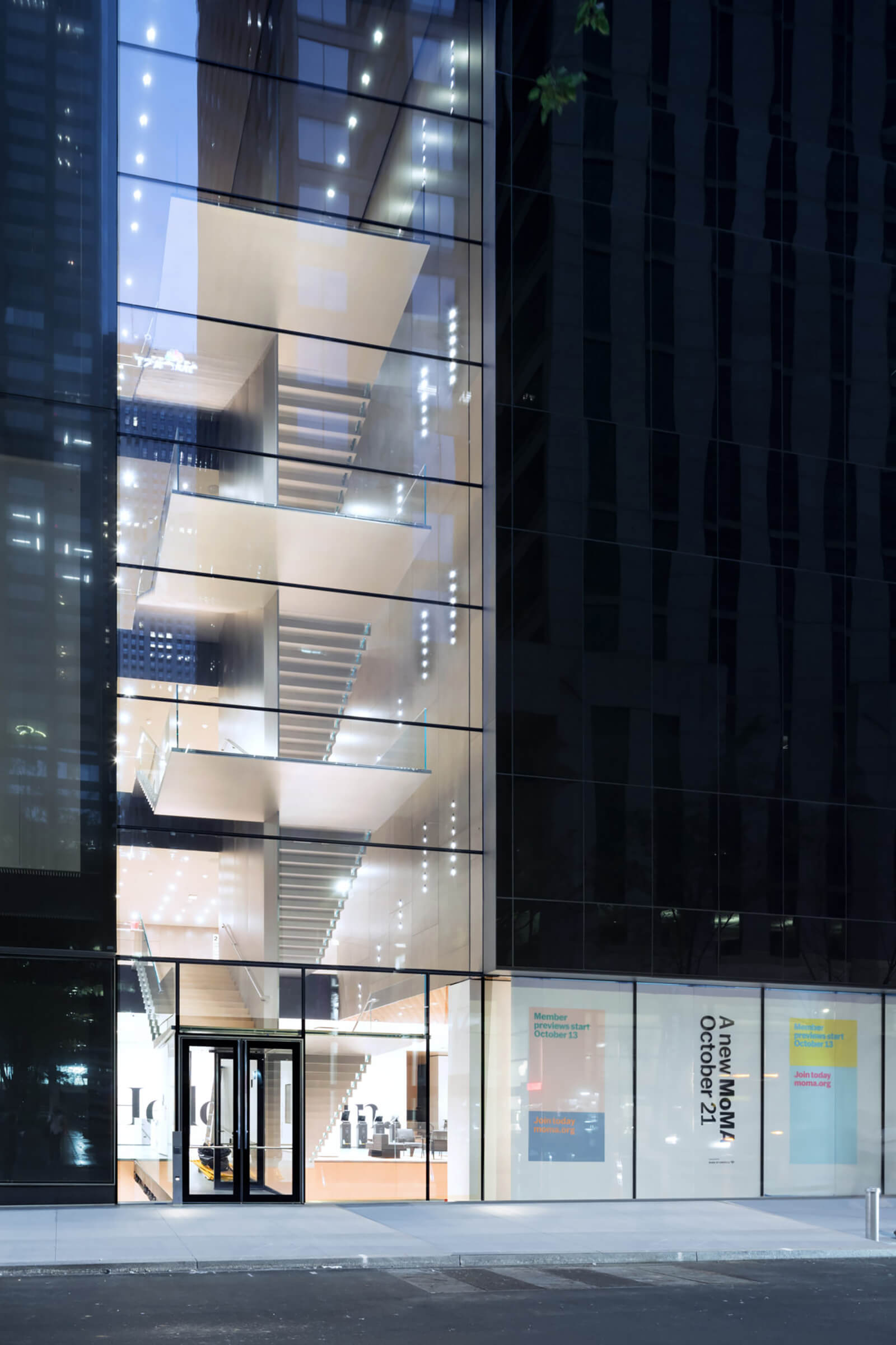
Exterior view of The Museum of Modern Art, Blade Stair Atrium, 53rd Street
COURTESY: MoMA / PHOTOGRAPH: Iwan Baan
“The six-storey, glass-fronted building consists of 47,000 square feet of new and renovated gallery space”
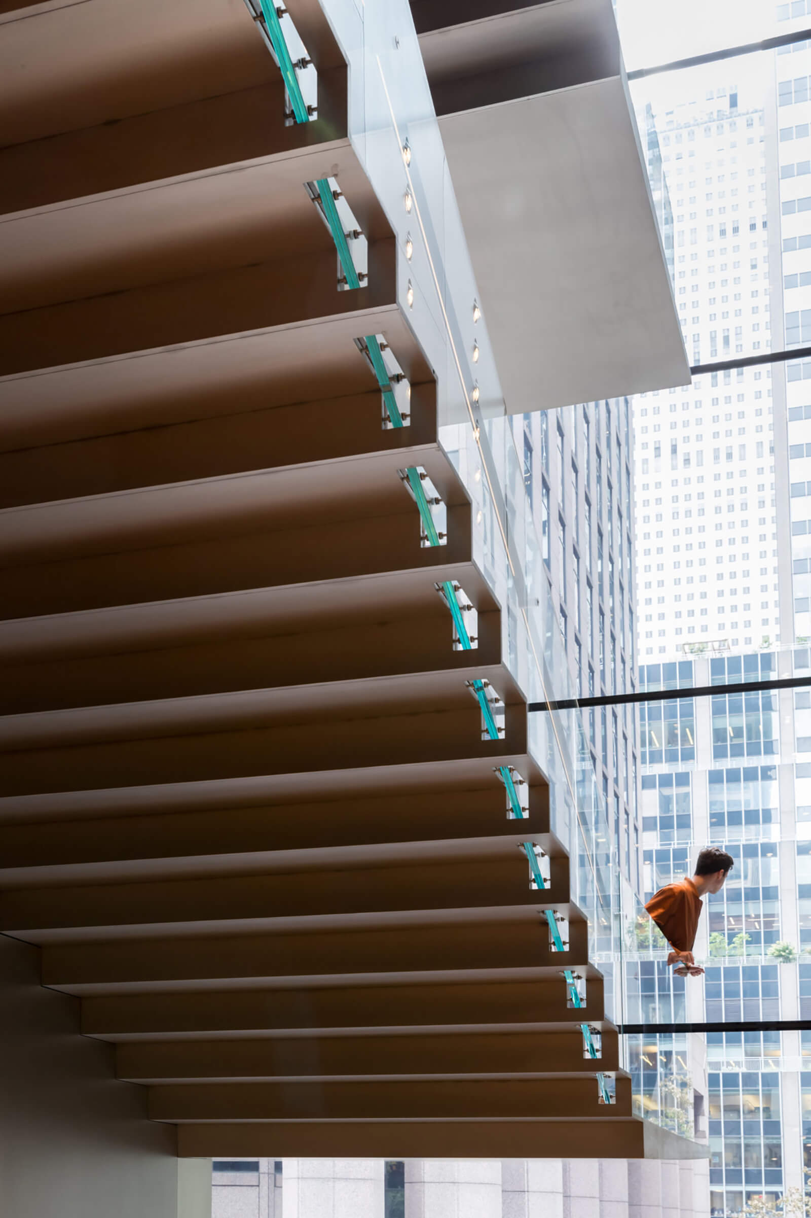
Interior view of The Museum of Modern Art, Blade Stair
COURTESY: MoMA / PHOTOGRAPH: Iwan Baan
“With the new expansion, annual attendance of visitors is expected to be over 3.5 million”
Russell Lynes’s 1973 history of the museum, Good old Modern, ended with the suggestion that a cabal of young art enthusiasts should start a new institution that would be “prophetic and fresh and outrageous.” That seems to be what MoMA is finally trying to do … perhaps belatedly, but no less welcome for that.
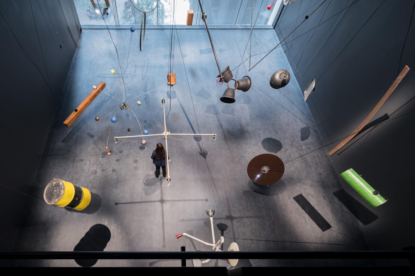
Installation view of the Marie Josée and Henry Kravis Studio, The Museum of Modern Art
COURTESY: MoMA / PHOTOGRAPH: Iwan Baan


